

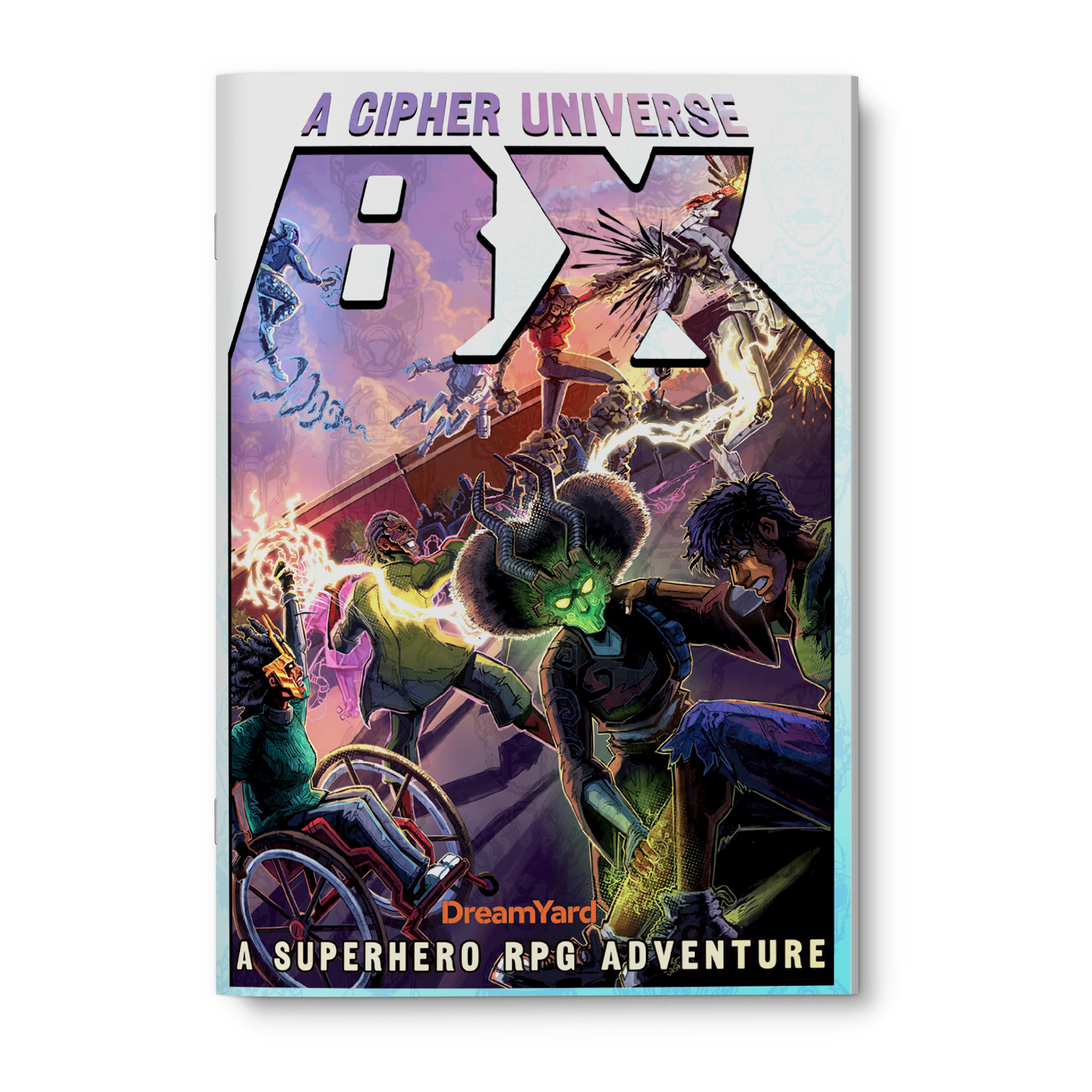
Shortly before I moved to Nairobi I got an email from Rudy Bianco at Dreamyard NYC, an arts and social justice organization dedicated to working with Bronx youth, families, and schools to build pathways towards equality and opportunity. The job was design and layout for a superhero-themed TTRPG tackling themes of racial, economic, and gender justice, geared towards after school play sessions with at-risk youth.
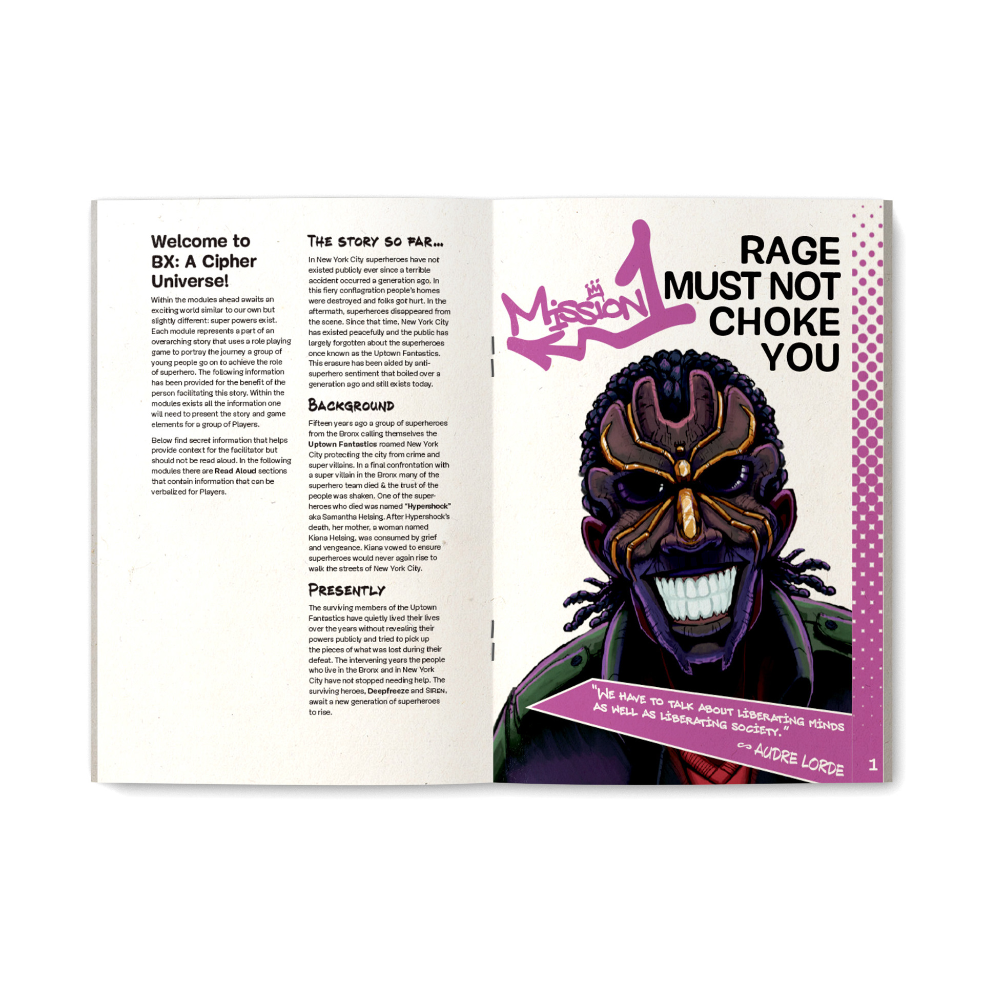
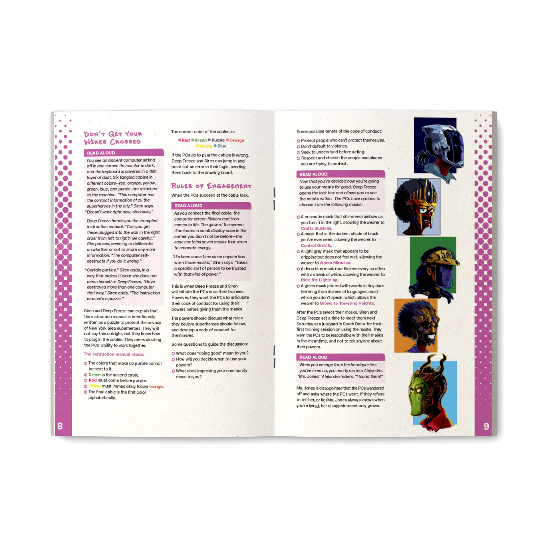
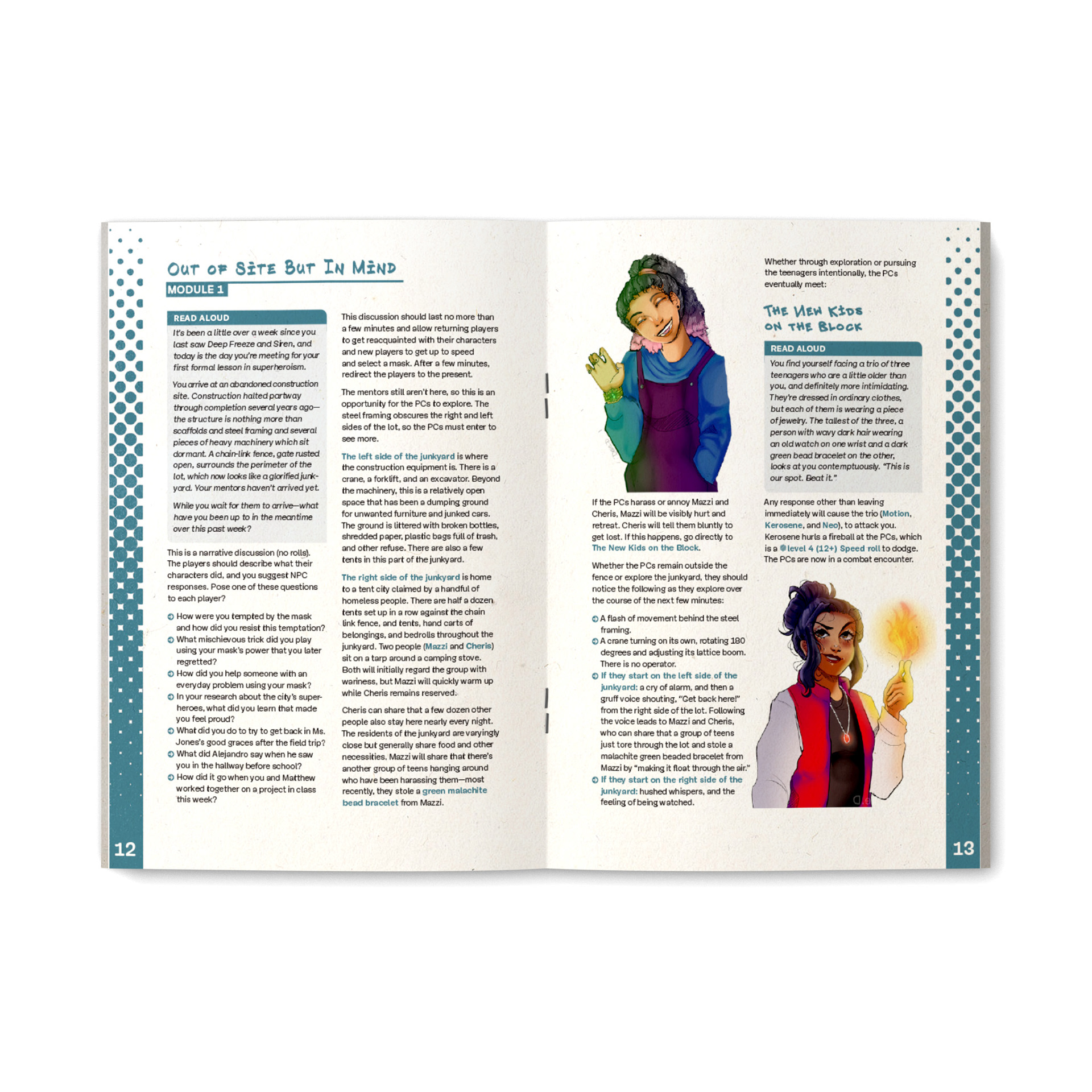
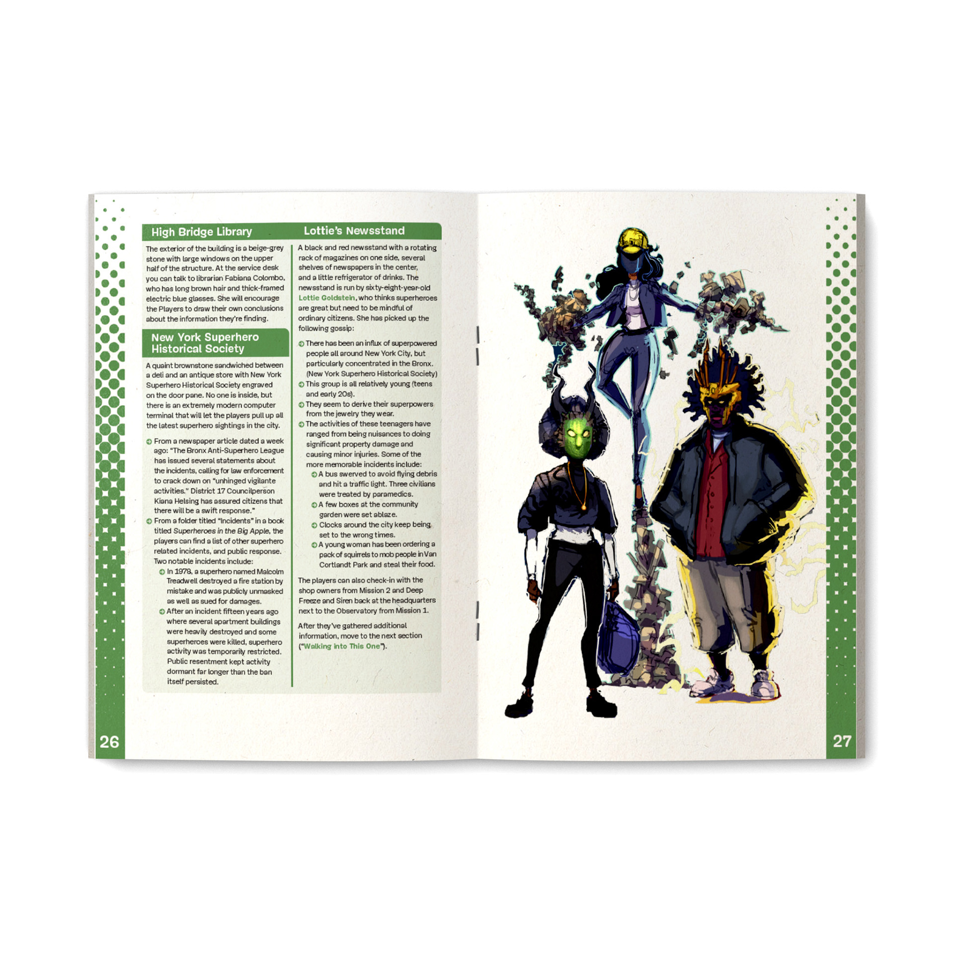
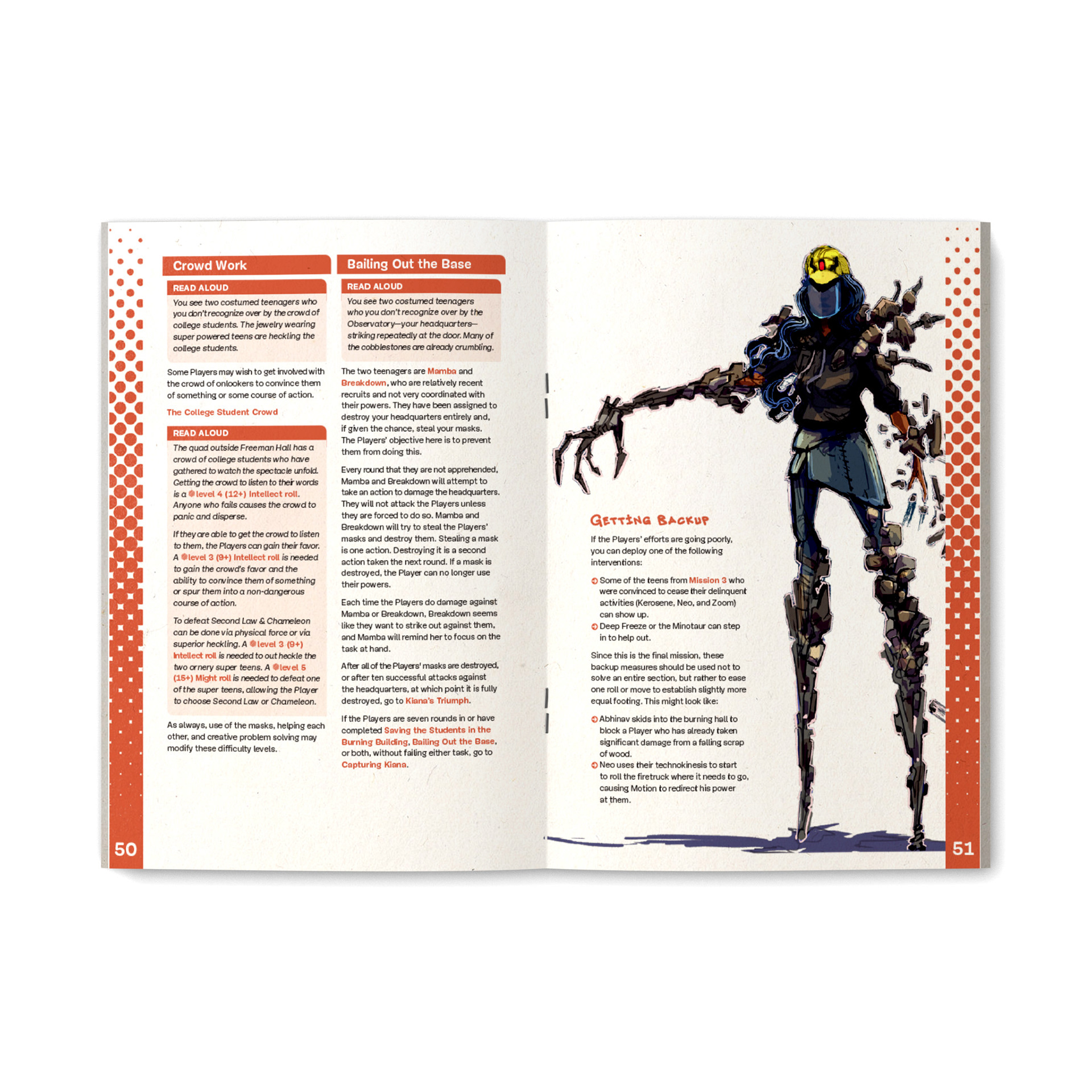
Given the stakes, I knew it was important that the book be as immediately captivating as possible. A maximalist comic book style with a heavy use of fonts taken from actual graffiti tags in NYC helped sell the authenticity of the material. The five adventures themselves were color-coded via running sidebars and call-out boxes corresponding to the colors of the five superhero masks in the story, a theme that’s reinforced by the same masks being tiled for the endpapers and NPC pages.
The layout of the book is steeped in NYC culture, with bulleted lists recalling the iconicography of subway directories. The font used in the body copy is Mija, from Chilean designer Miguel Hernández. It’s a typeface I’ve grown increasingly fond of for body copy, as its roundness and occasional irregularity invoke a human friendliness without any of the suspicious sterility usually found in “friendly corporate” fonts. It’s a font that’s inspired by handmade signs, and that struggle for recognition, that bold and humanistic approach to living, is one that I think resonates with the mission of DreamYard. In a world of Coca-Cola billboards and Apple bus stop adverts, the humble “BARBER SHOP” sign is all the more intriguing.