

I’ve had a lot of fun producing Squishy! books over the years. There’s five of them as of right now, about a year or so apart, and reading them in order really showcases my development as a self-taught designer. The Mall at Midnight is one of the more cohesive ones I’ve done, without any of the wild swings in tone of something like Campfire Carnage or the amateur charm of The Halloween Babysitter. Instead, it takes one premise — a trashy, beaten-up zine made by deranged mall goths — and runs with it.
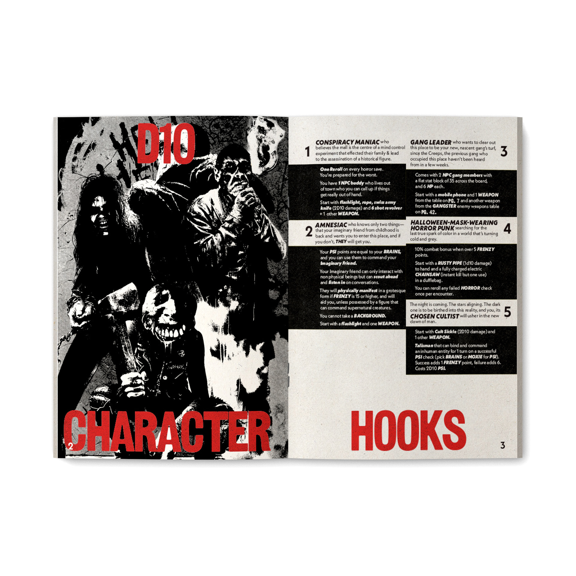
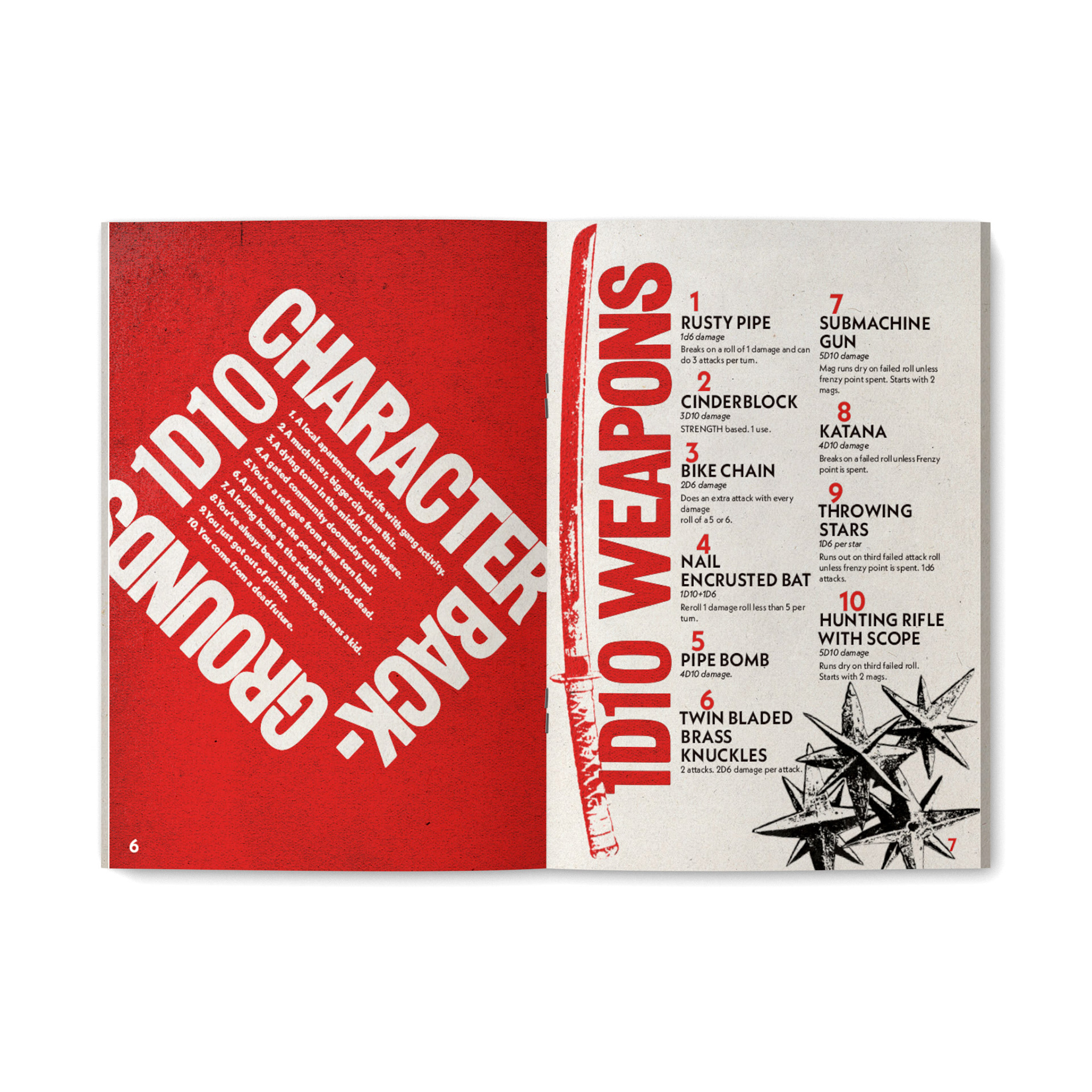
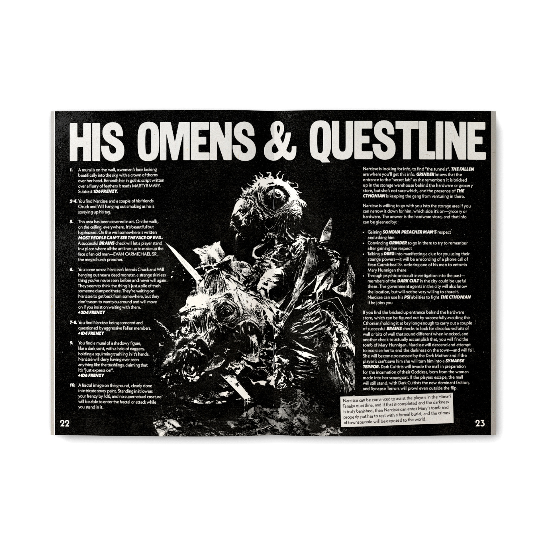
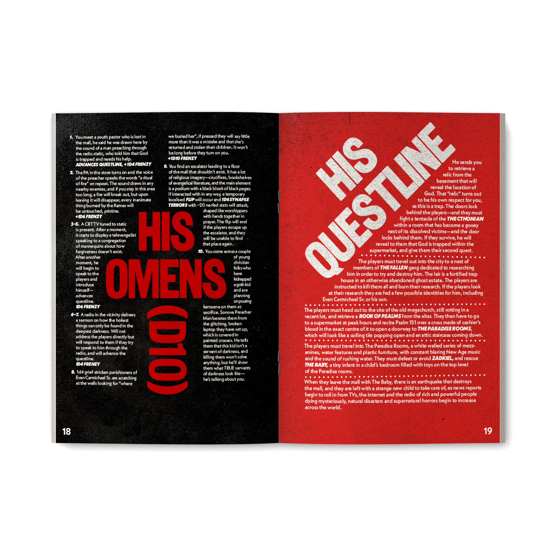
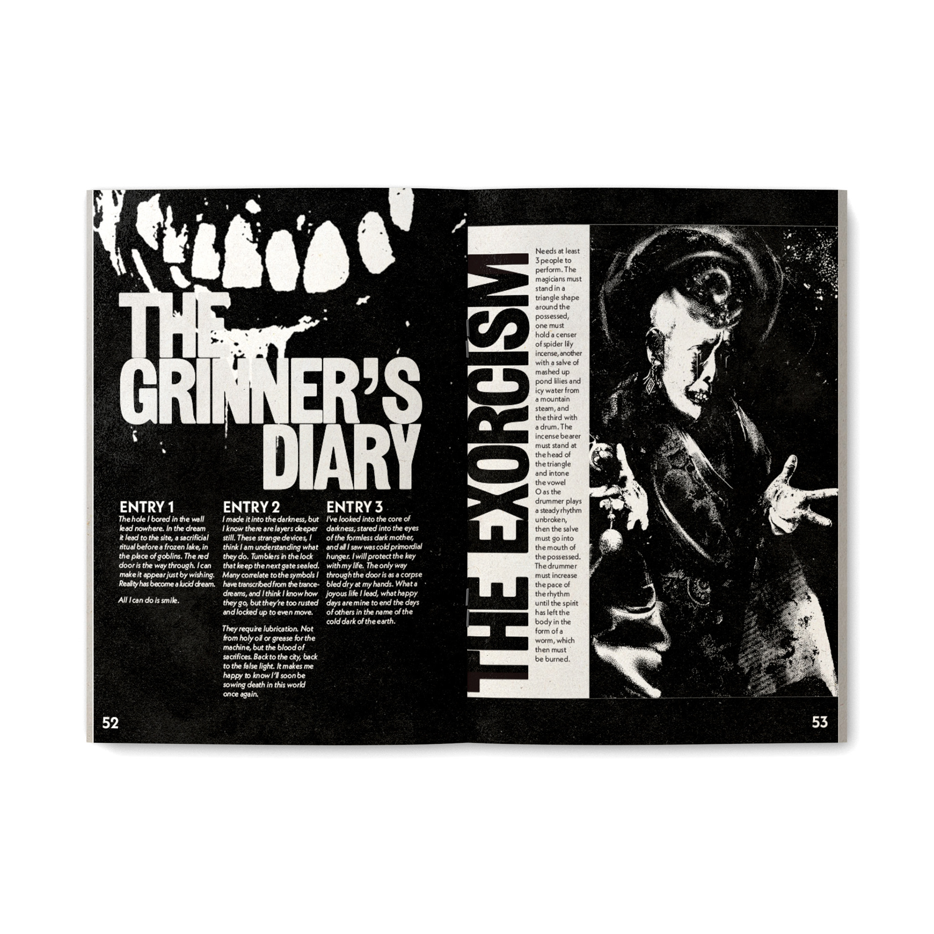
It helps that the artist, Delancey Throne, is a goddamn mastermind in working with high-contrast black-and-white. Due to the nature of the art, I eschewed my usual disdain for fake paper textures and went wild; the book you get might be crisp and still warm from the digital printer, but it’s going to look like a shitty band poster that’s been photocopied a few too many times, dammit. Because each page is so scuzzy, I felt that the text needed to be relatively simple and very, very big. We’re talking 72pt headers in as high-contrast a color compared to the background as possible. Whether or not that text is upright is another matter.
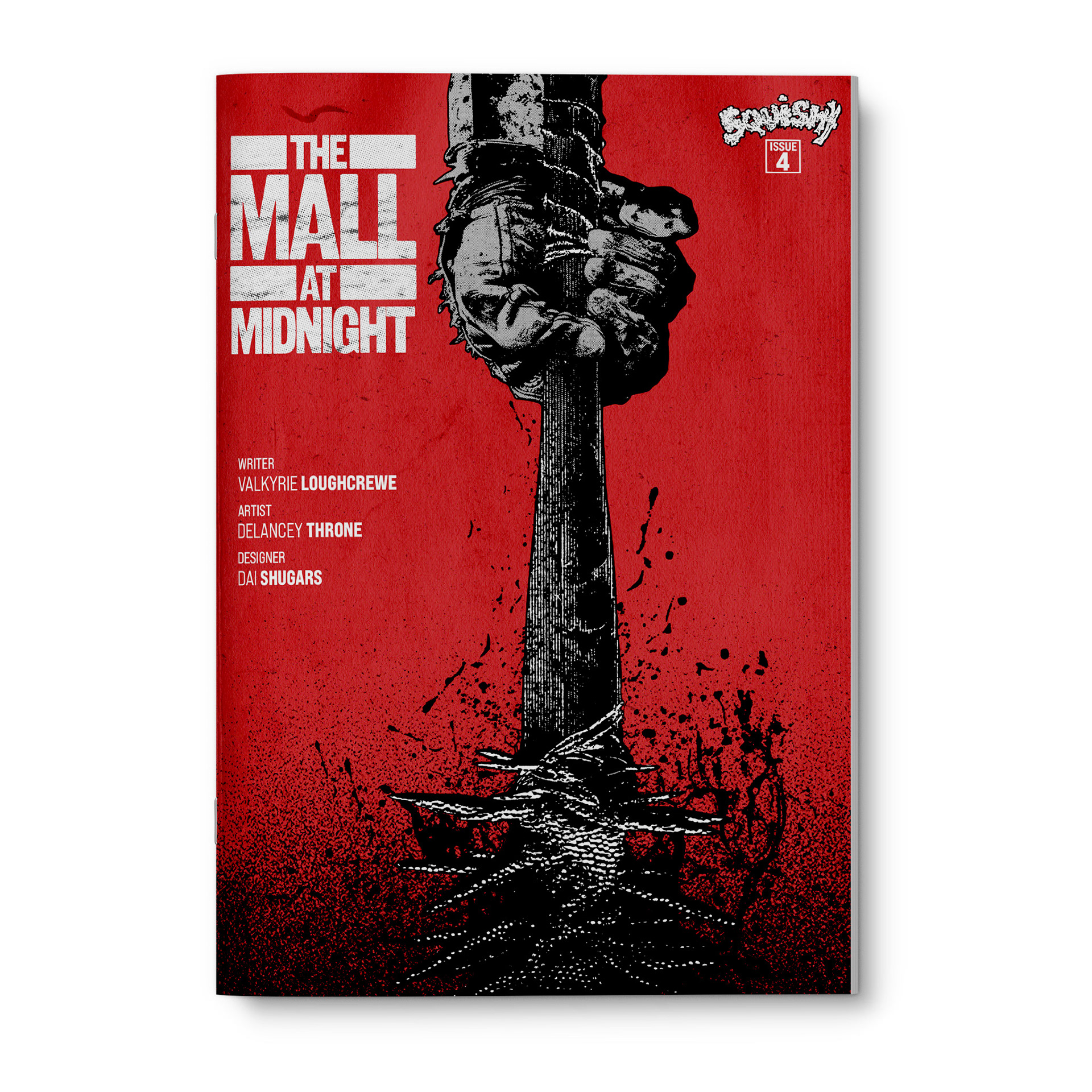
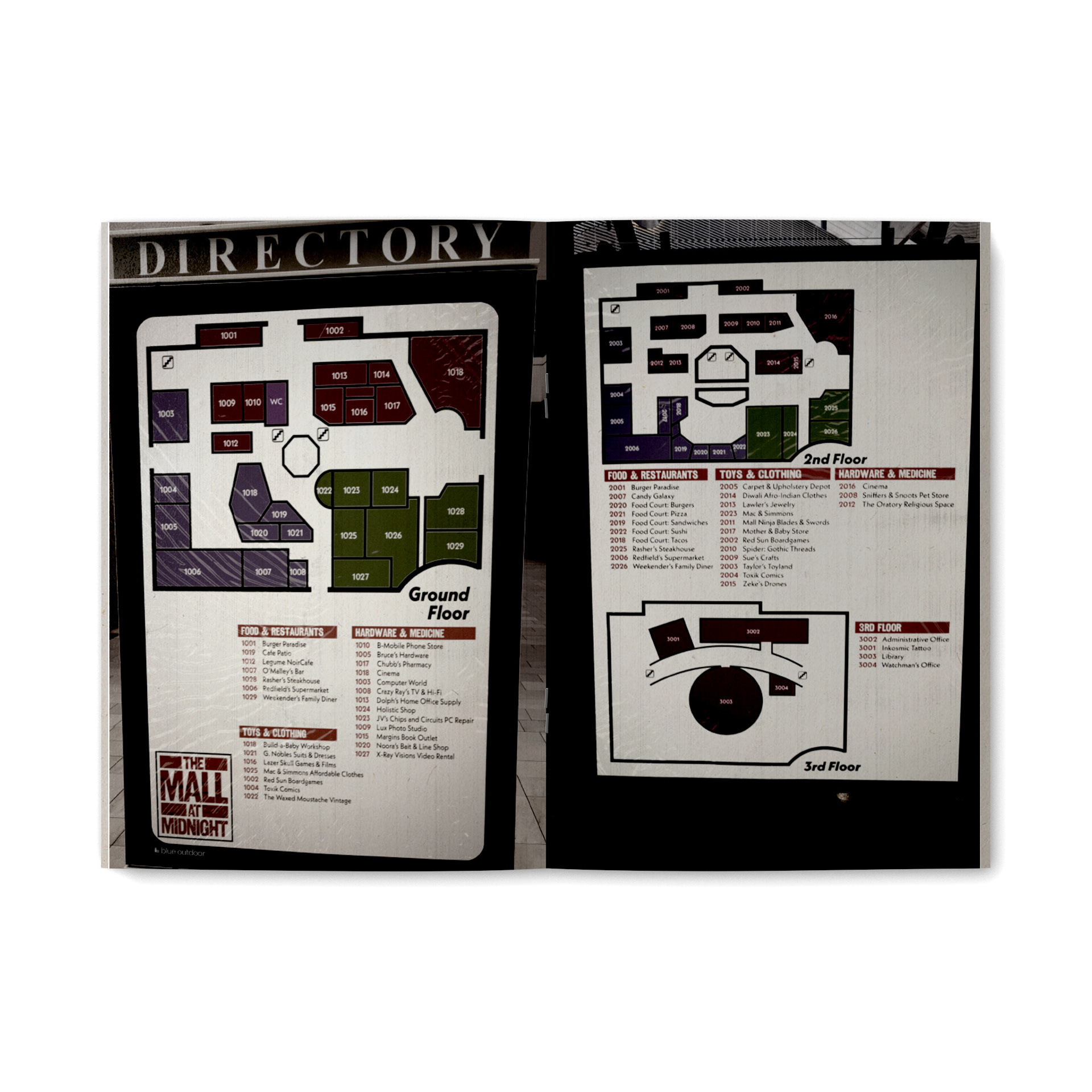
There were a few places where I filled space with my own art, repurposed from the public domain. I went a bit Barbara Kruger with an image of a church revival, and the map of the mall was designed in Illustrator and then overlaid onto actual photos of mall directories. The cover, despite its simplicity, is one of my favorites.
I’m not always in the mood to design for horror, but I’ll do a Squishy! book every year until I die, and I’ll do it with a smile on my face.
It helps that the artist, Delancey Throne, is a goddamn mastermind in working with high-contrast black-and-white. Due to the nature of the art, I eschewed my usual disdain for fake paper textures and went wild; the book you get might be crisp and still warm from the digital printer, but it’s going to look like a shitty band poster that’s been photocopied a few too many times, dammit. Because each page is so scuzzy, I felt that the text needed to be relatively simple and very, very big. We’re talking 72pt headers in as high-contrast a color compared to the background as possible. Whether or not that text is upright is another matter.
There were a few places where I filled space with my own art, repurposed from the public domain. I went a bit Barbara Kruger with an image of a church revival, and the map of the mall was designed in Illustrator and then overlaid onto actual photos of mall directories. The cover, despite its simplicity, is one of my favorites.
I’m not always in the mood to design for horror, but I’ll do a Squishy! book every year until I die, and I’ll do it with a smile on my face.