
ARC: Doom Tabletop RPG was a breakout hit in 2021, raising nearly $90,000 via Kickstarter and receiving numerous awards and accolades from industry publications like Dicebreaker and IGN. That success meant I was contracted to design three adventure supplements for the game: Bitter Sun, Leviathan & Loom, and Carry On, Wayward Weapon.
Each of these was written and illustrated by a different team, and aside from a few trade dress requirements how they looked was entirely up to me. This is an exciting opportunity for any designer, particularly one like me who enjoys playing with different styles and forms of presentation.
Bitter Sun was the book most obviously inspired by southeast Asian folklore and culture, and as such has the most local flavor in its visual design. Maragsâ, the font used for pull quotes and headers, is a creation of Filipino designer Jad Maza and takes its design inspiration from pakupyâ accent marks that serve as a guide for pronounciation in the local tongue. Batik textile patterns can be found on several pages as background or accent art, most notably on the front and back endpapers. These were used to echo the patterns used in the art by Filipino artist Danielle Florendo.
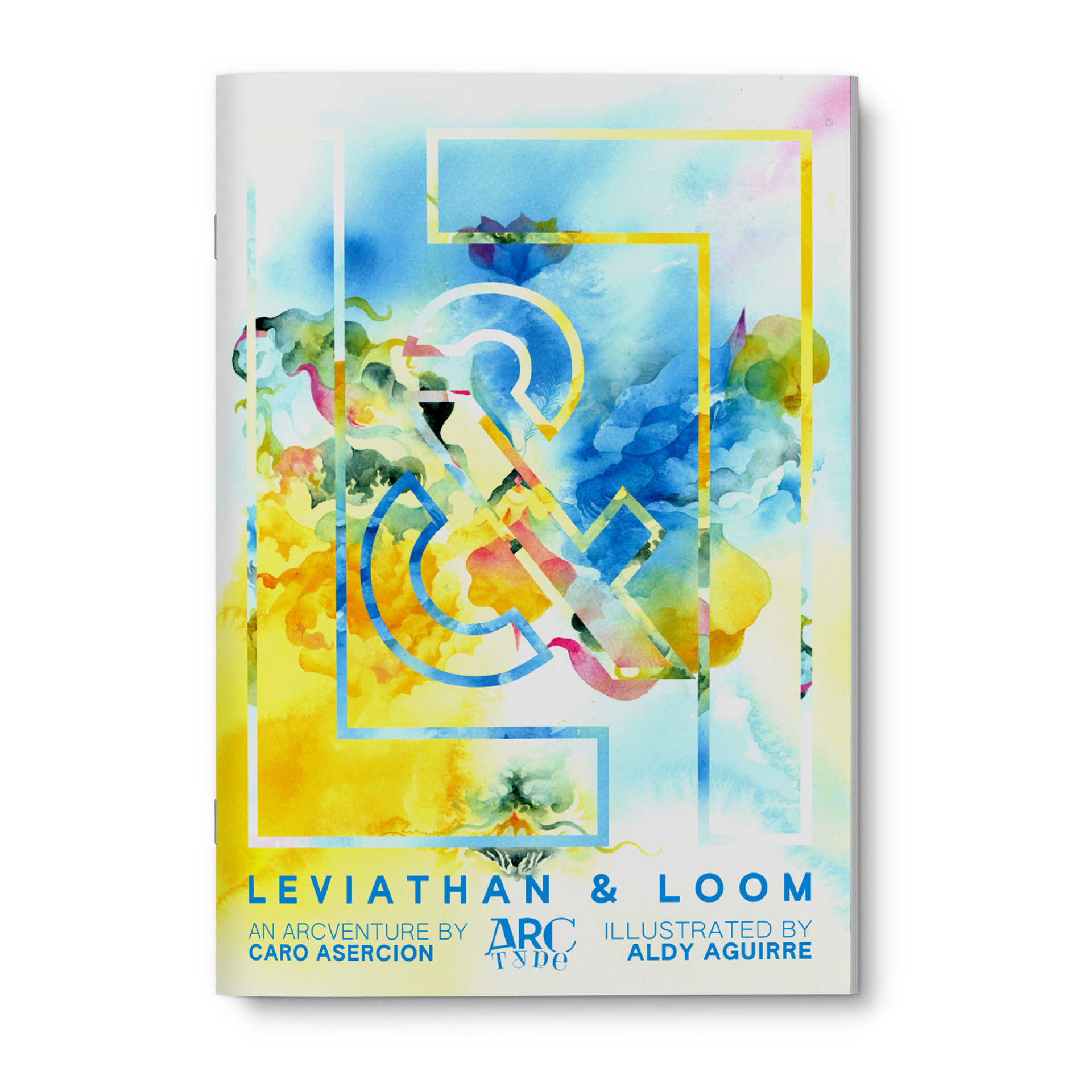
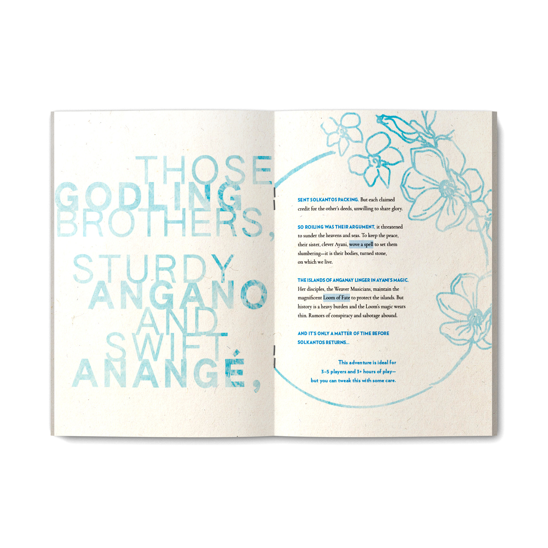
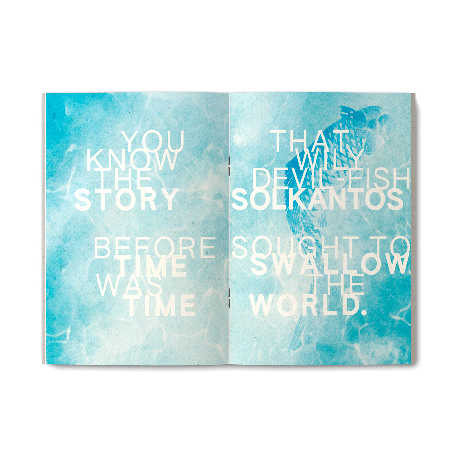
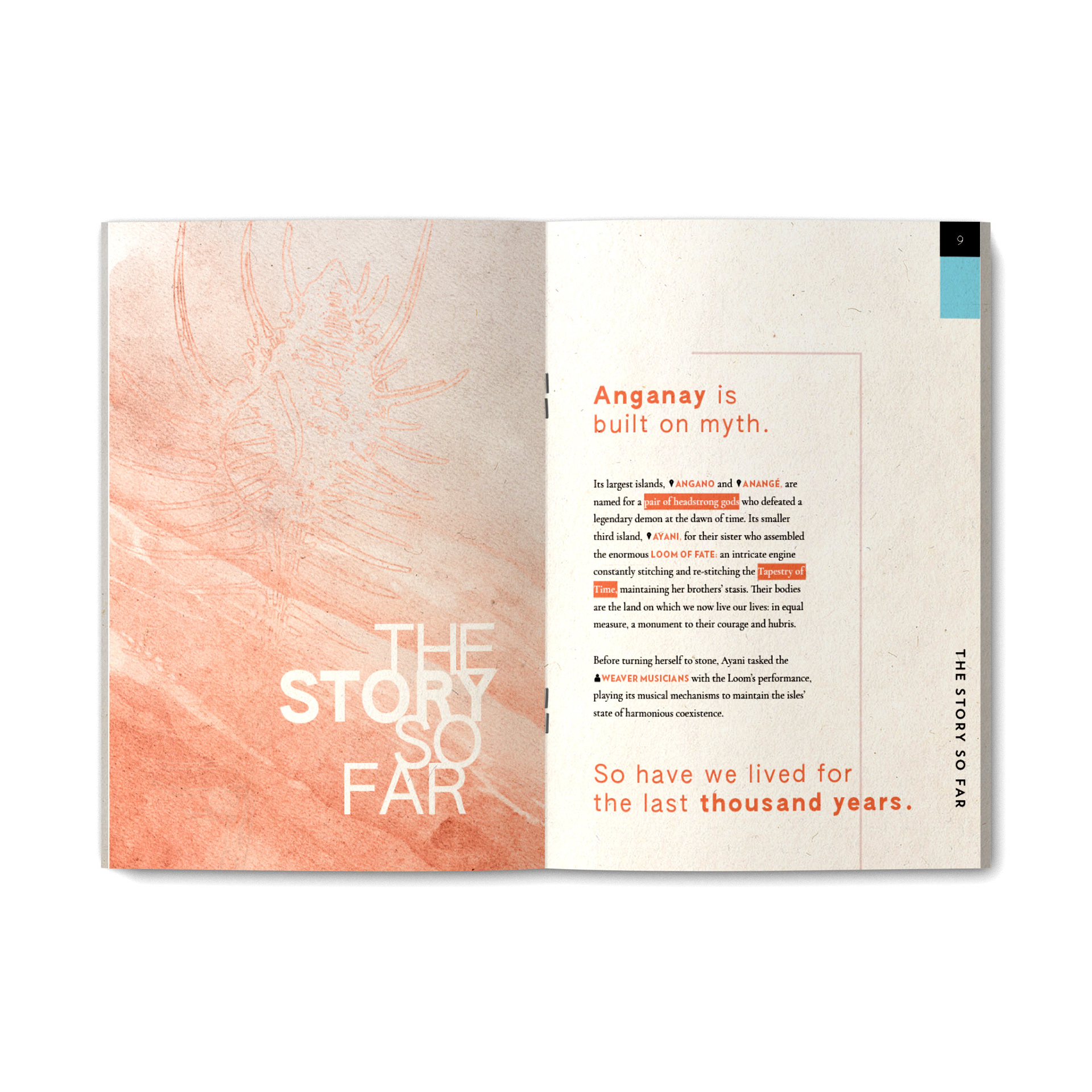
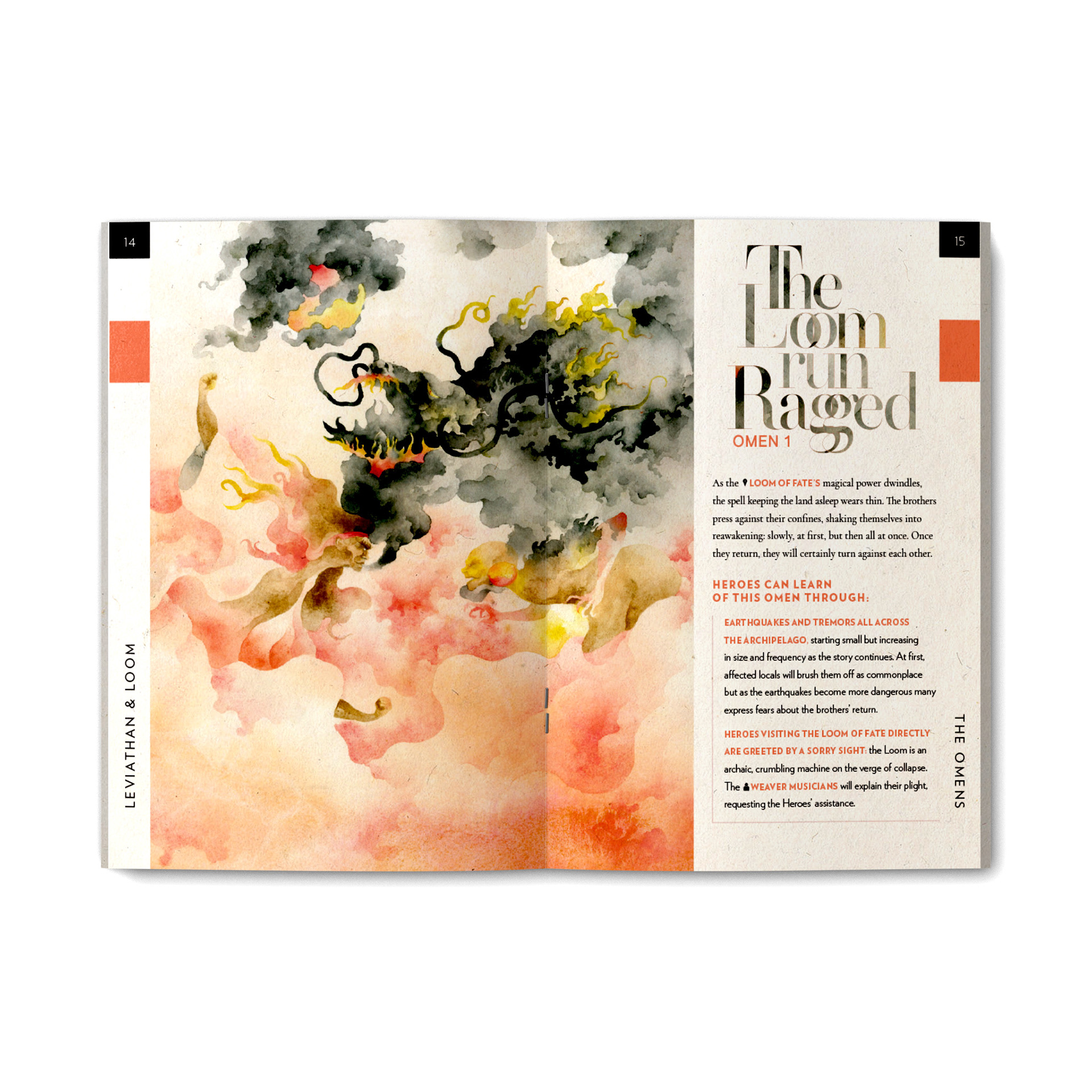
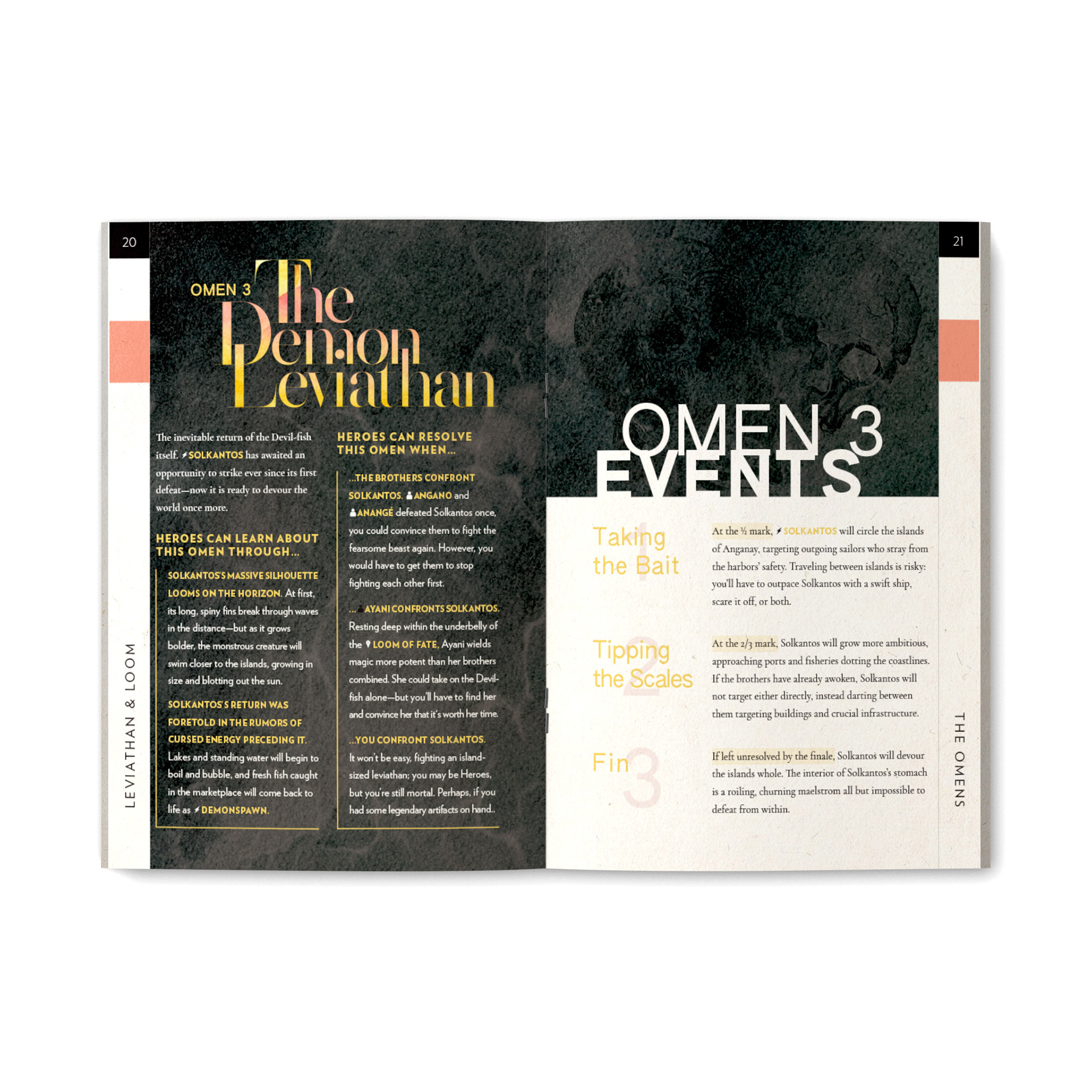
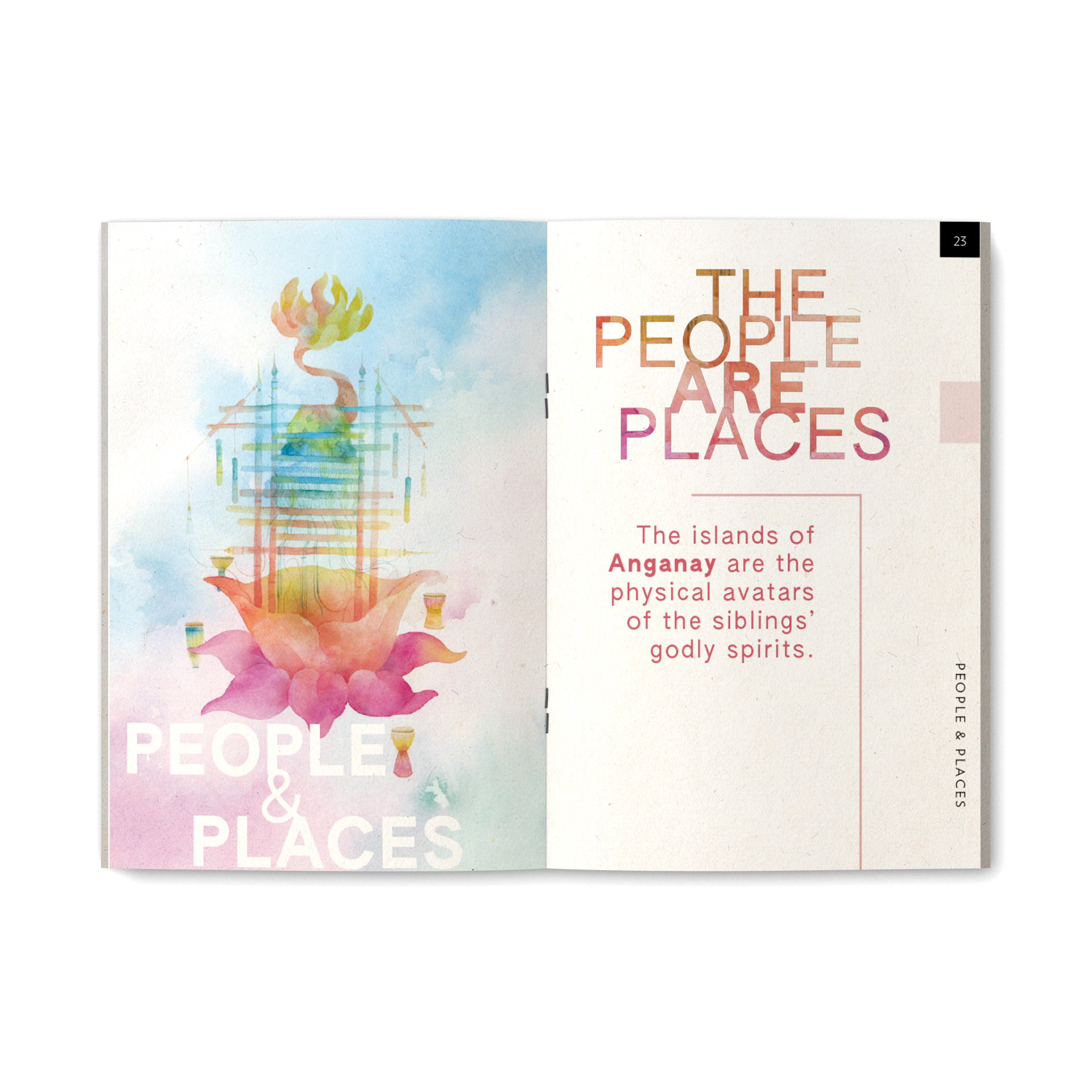
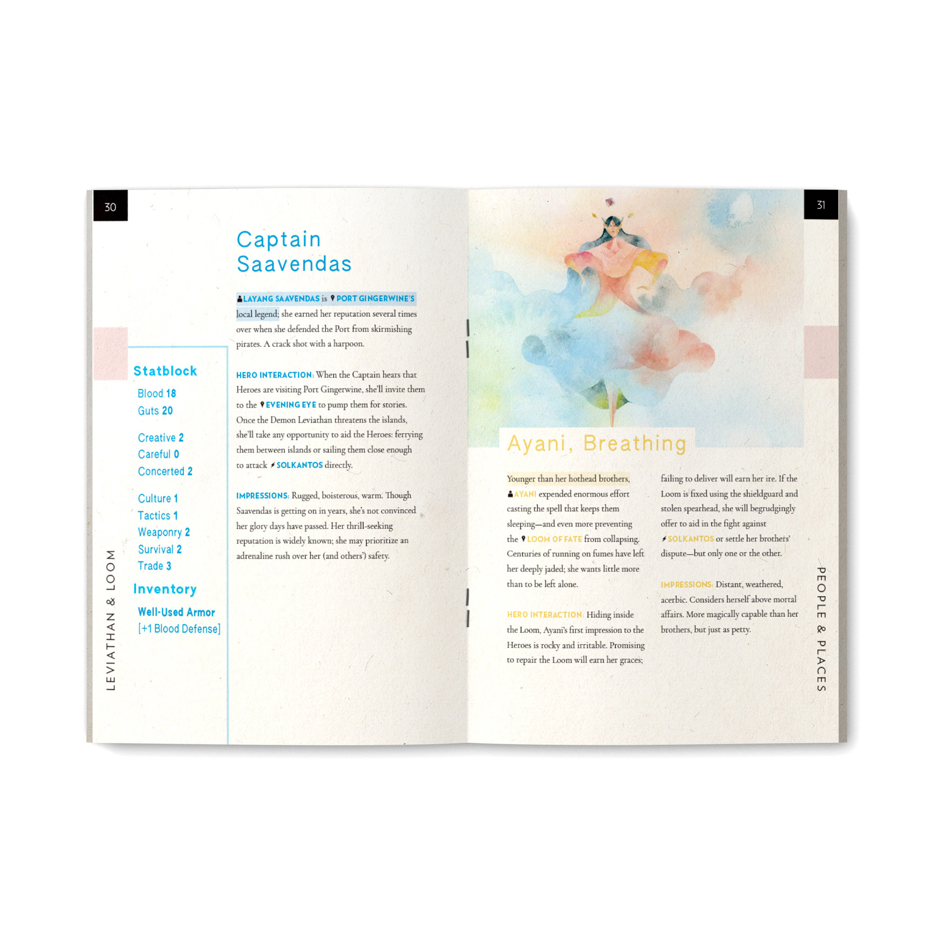
The second book, Leviathan & Loom, is also inspired by SE Asian folklore, but the story here revolves around the gods and goddesses of a chain of islands. Unlike the heavily-patterned and deeply-colored illustrations of Bitter Sun, the artwork here is made up of bright, vibrant watercolors, and thus the book was allowed to breathe a bit more. Headers and pull quotes are set in high-contrast didones and geometric sans typefaces with generous letterspacing, with frequent use of colored type, knockout type, and images laid over text. The cover, which features a geometric interpretation of the title cutting through and reversing the background image, is a design I’m particularly fond of, and I would return to the idea of reversing and overlaying art onto images several times more in my career.
For Carry On, Wayward Weapon, the colorful cartoon art of Caro Asercion and story of a world ravaged by giant alien monsters suggested a definite aesthetic inspired by anime such as Neon Genesis Evangelion and Tengen Toppa Gurren Lagann. This meant big, bold sans serif type and a palette heavy in primary colors. The map and the “Omens of Doom” page were inspired by the screens and monitors in Neon Genesis Evangelion, specifically, along with the “warning” dialogue that appears before boss fights in SHMUPs.
The three books were printed and offered as a collection with Momatoes’ own adventure, The Minting of the World, via Exalted Funeral, and sold out almost immediately. Reprints are forthcoming.