

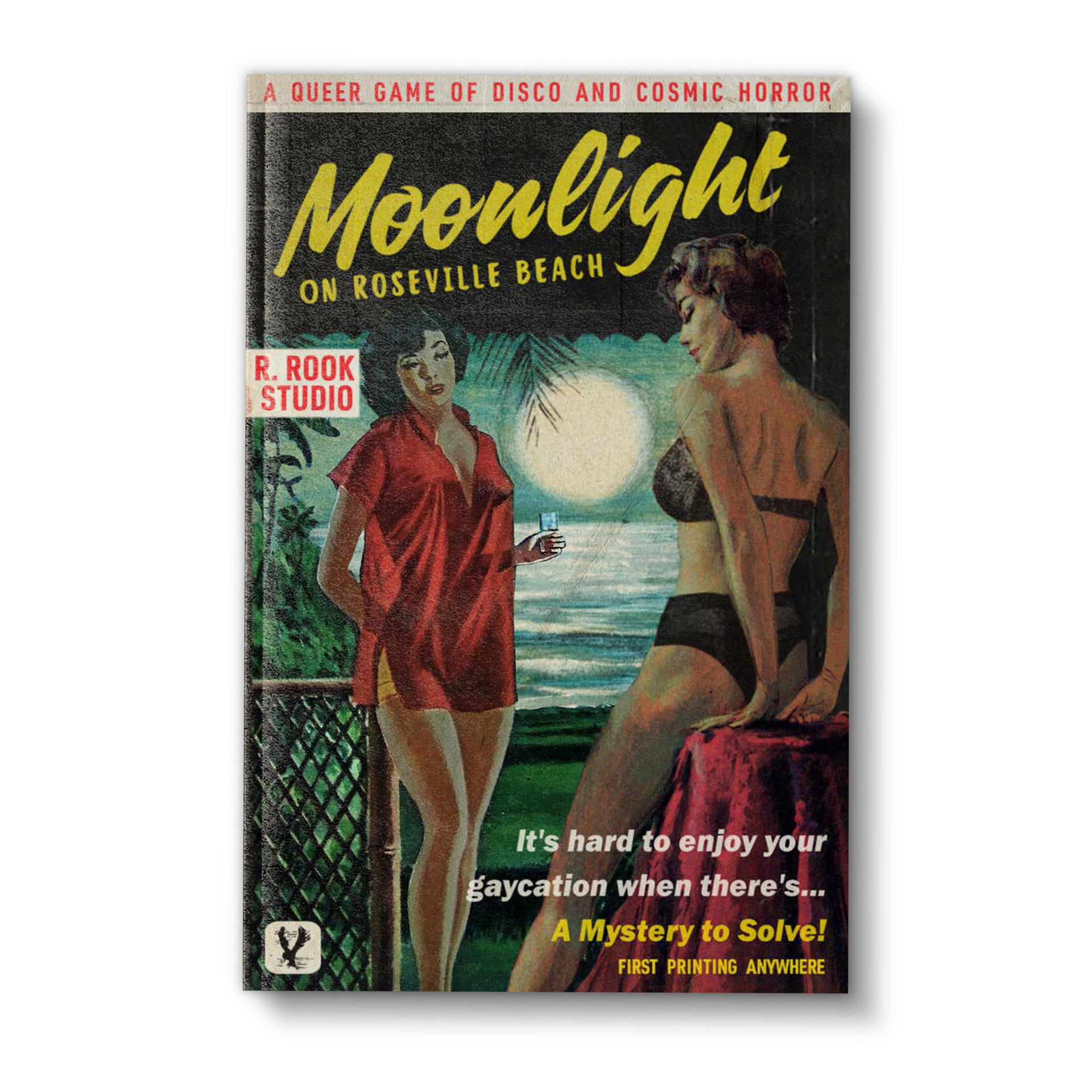
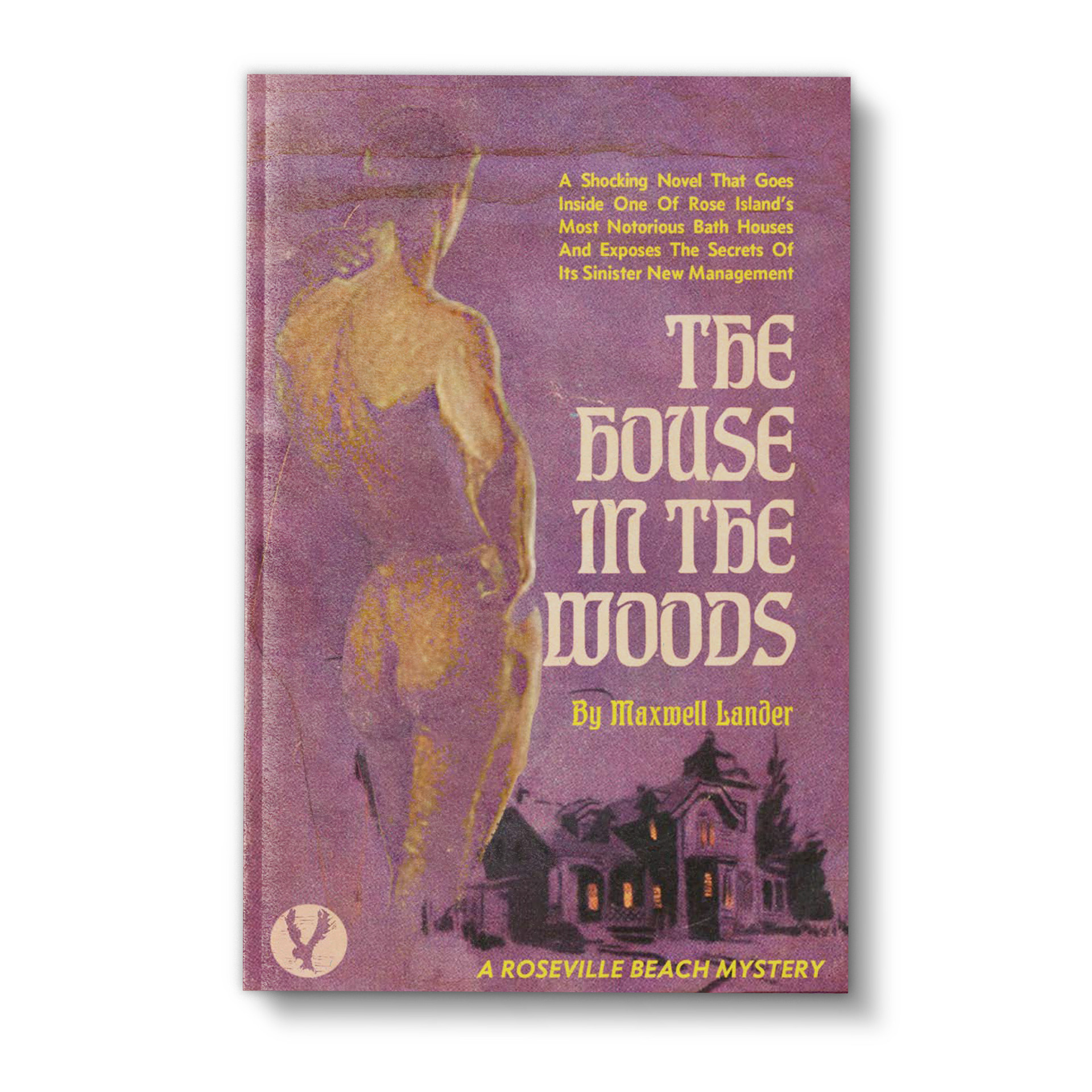
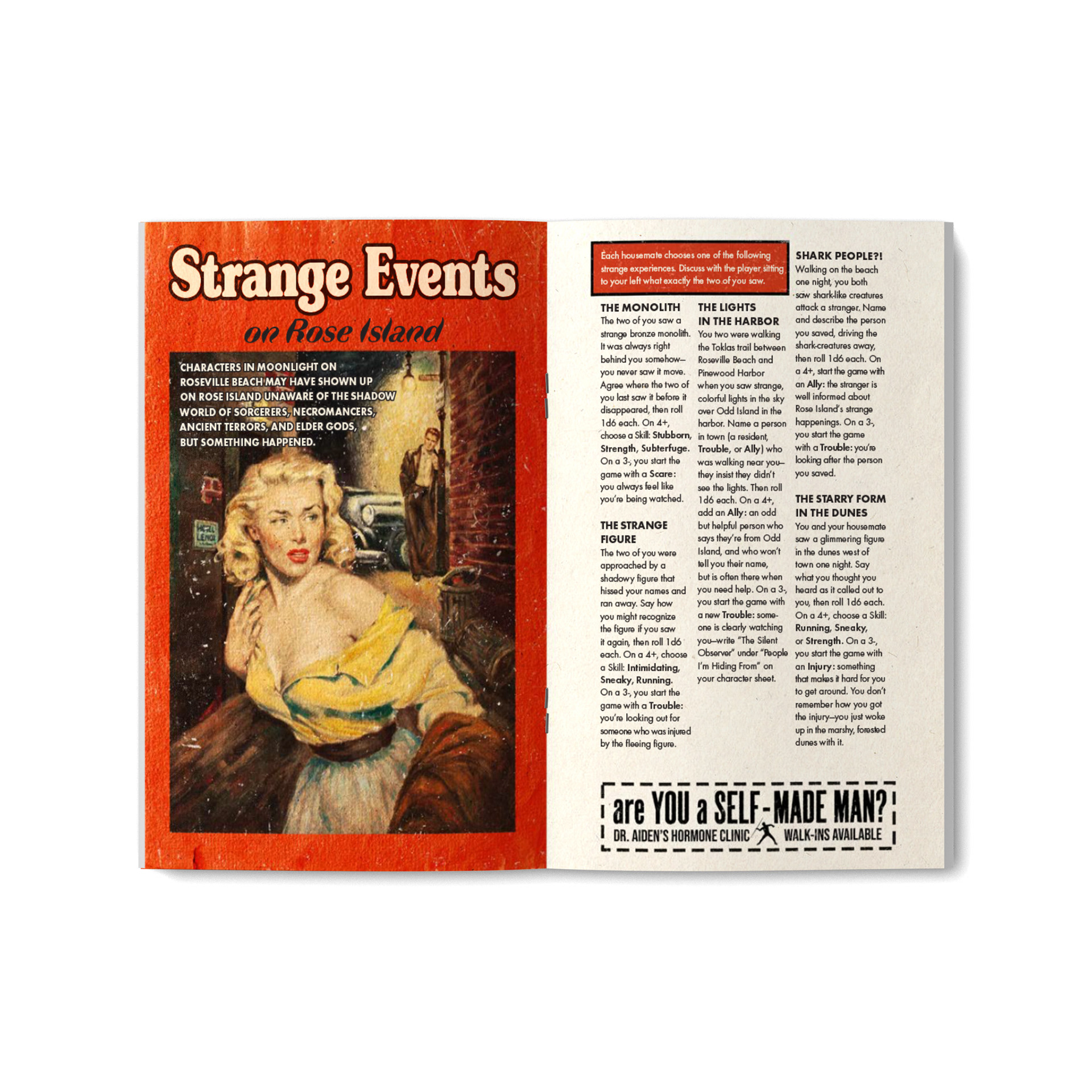
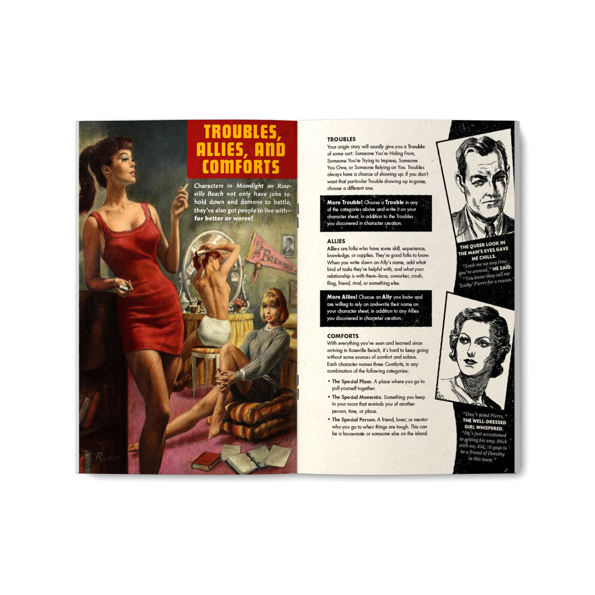
When Richard Ruane approached me about designing an RPG where you play as what amounts to the Scooby-Doo gang on Fire Island, my first thought was “okay, but I get to make a silly cover.” I had been reading American Pulp: How Paperbacks Brought Modernism to Main Street by Paula Rabinowitz at the time, and yet my first idea was to do the cover up like the tawdry self-published gay erotica you find in the deeper parts of Kindle Unlimited. You know the type: stock photo of a shirtless hunk poorly juxtaposed against a background of wolves or a pickup truck or a beach.
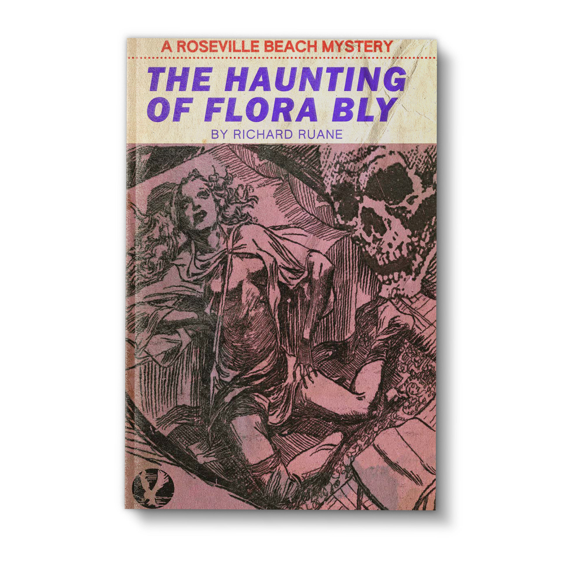
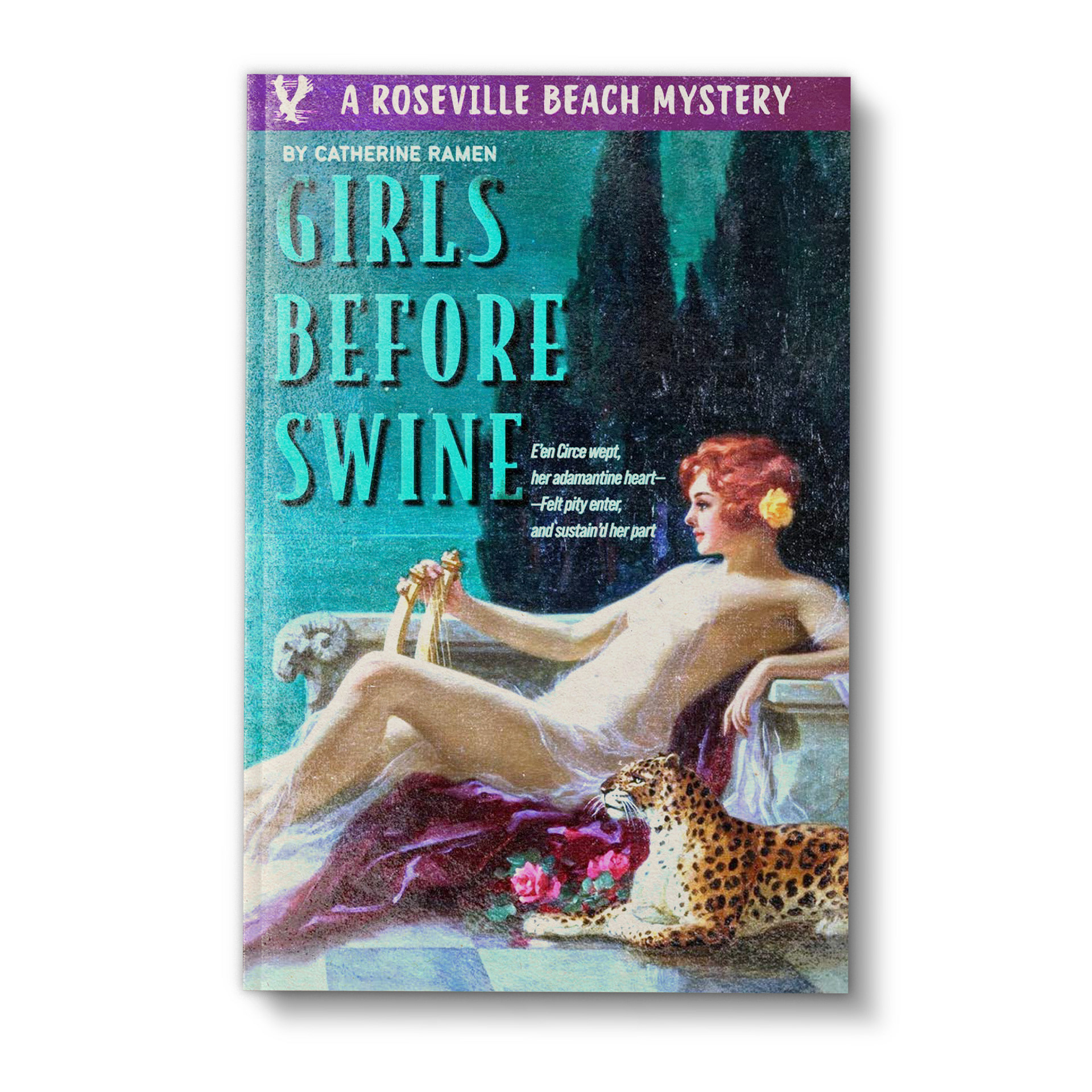
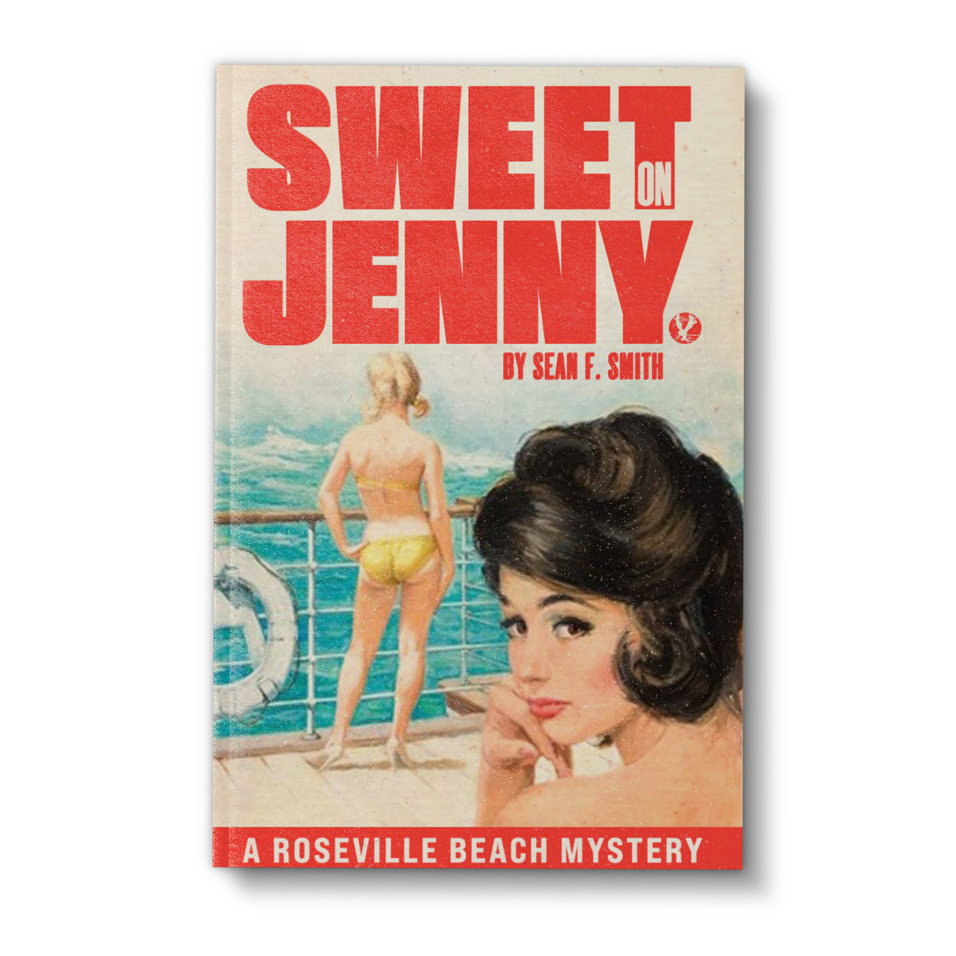
The problem with making something look deliberately bad is that it’s incredibly easy for it to slip into being actually bad. In a few decades, the current trends in ugly book covers might be seen as quaint and interesting, but in this day and age if you want good-bad you have to go back a few decades. And so I found myself photobashing three different paintings together, smoothing the edges down, and adding a set of underwear to a woman at the insistance of the censors. Little did I know at the time that I had struck the creative oil that would lubricate the creation of the entire Roseville Beach line.
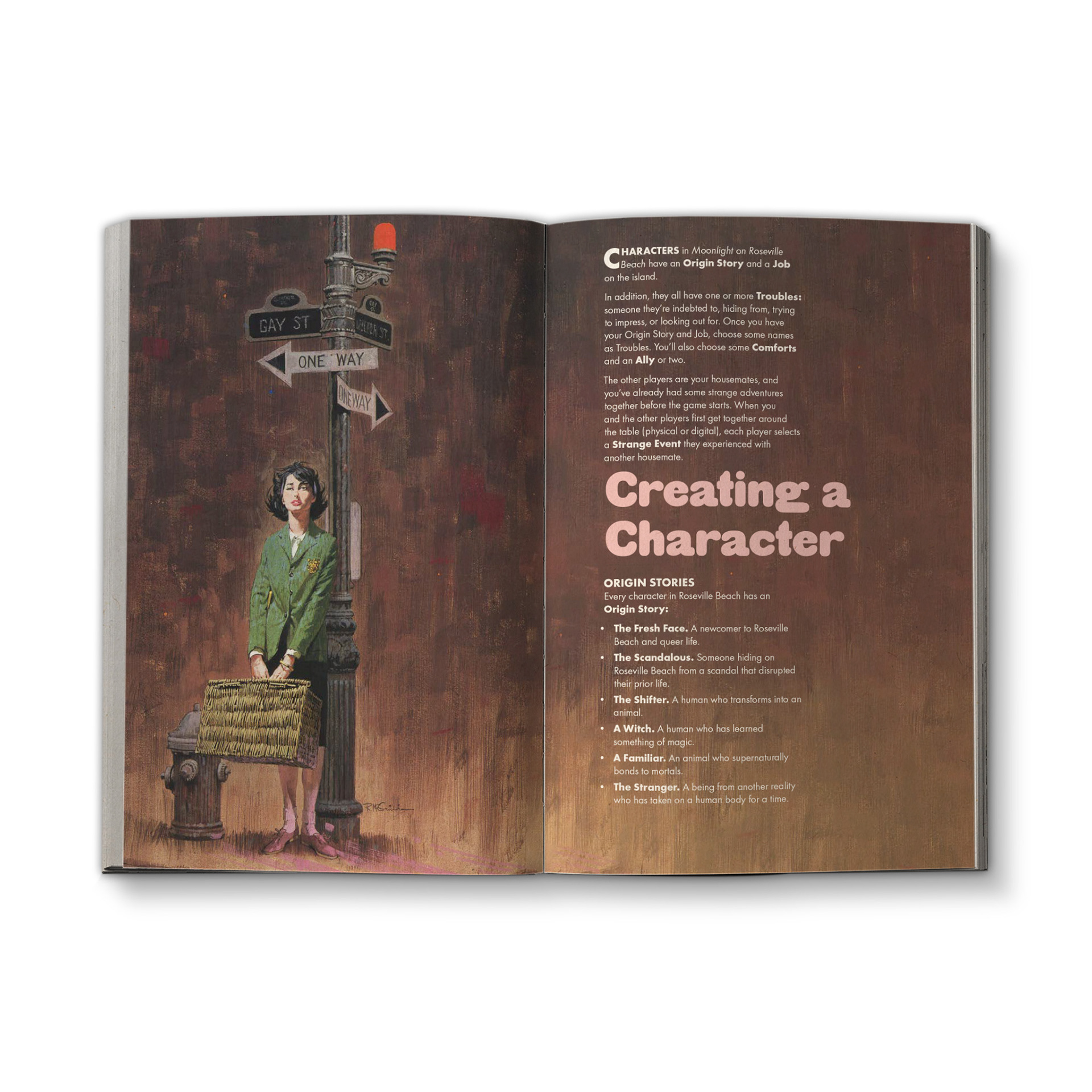
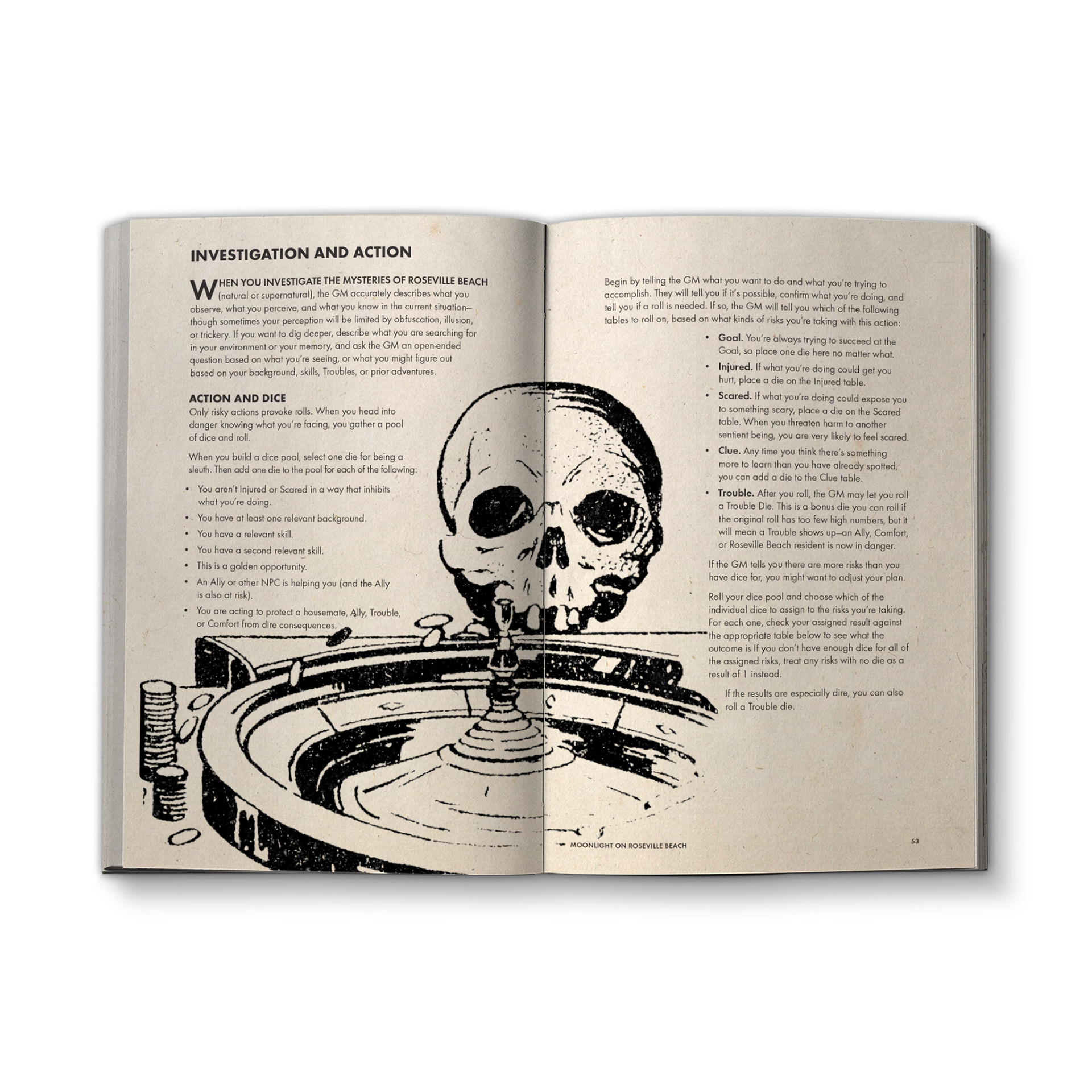
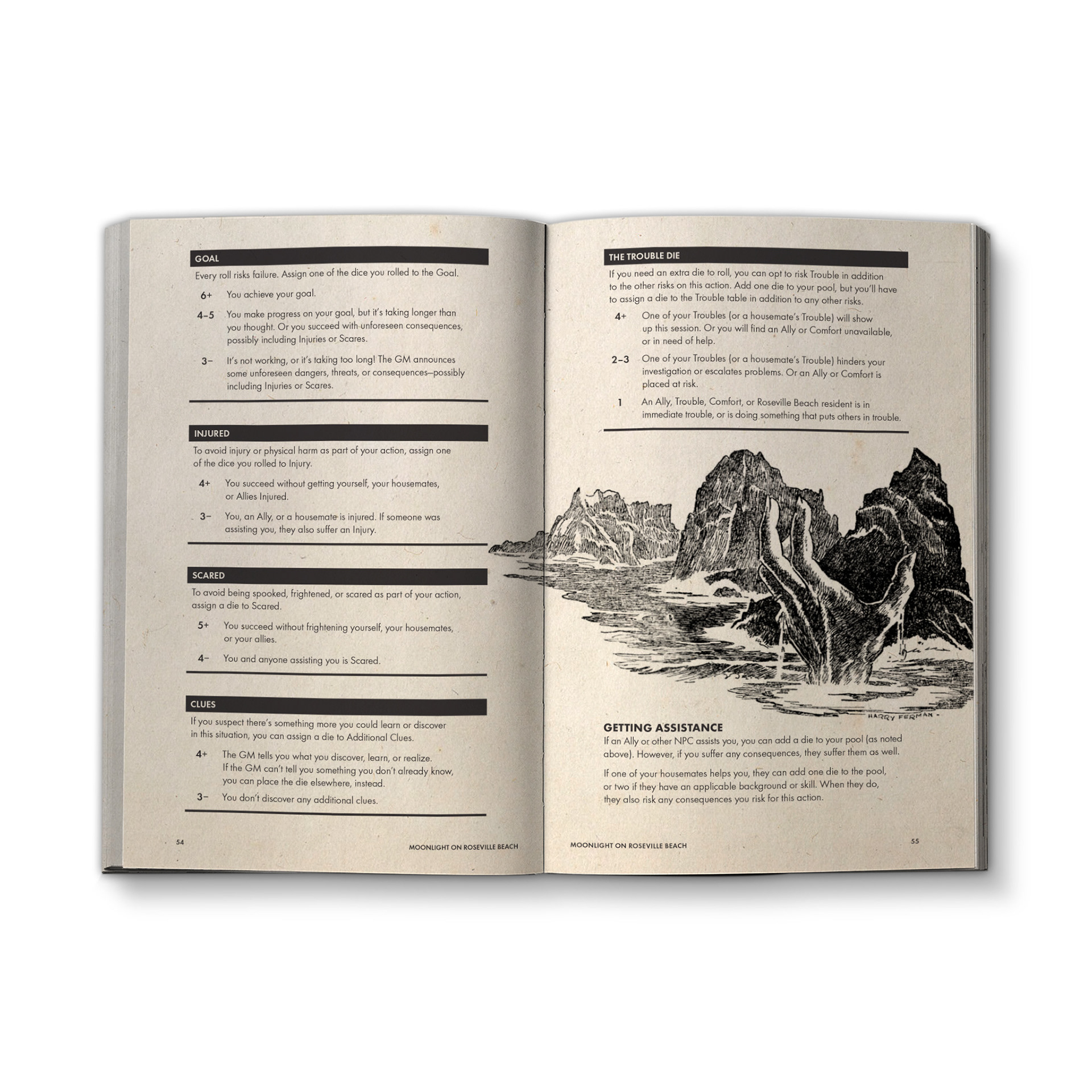
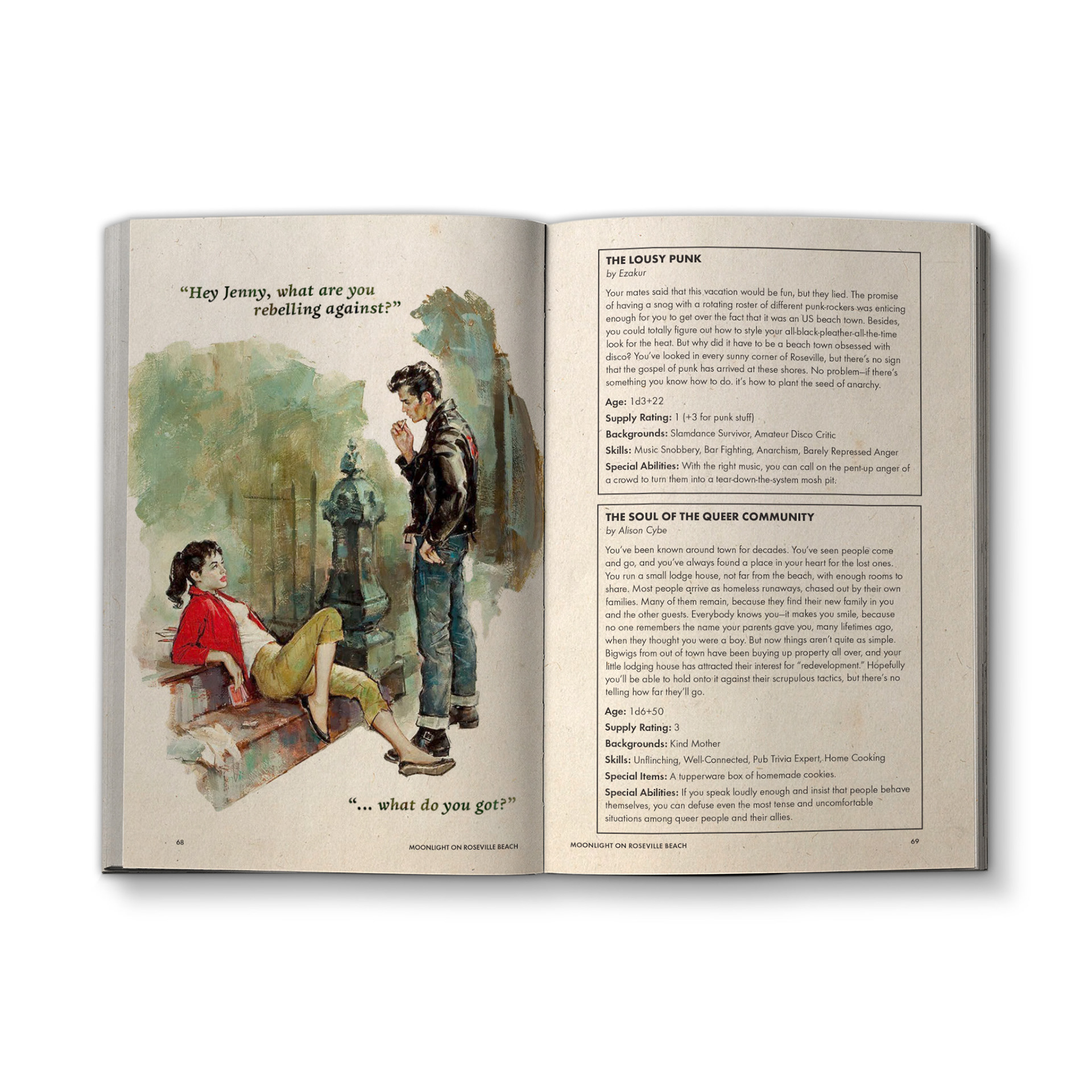
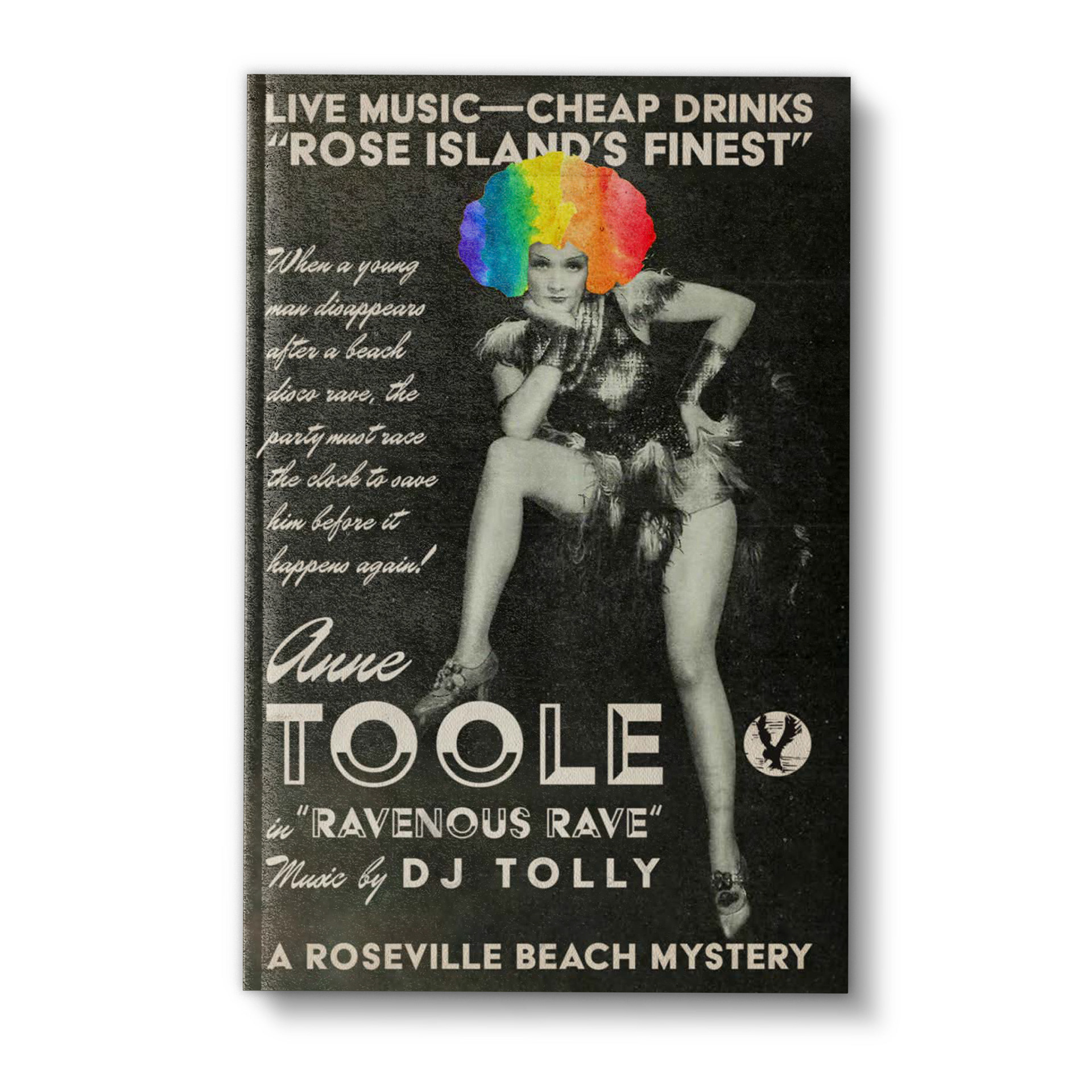
Without going into too much detail, the US copyright law is actually a lot less strict than most people think. Unless the creator has renewed their copyright, all works produced before 1964 are free to use for pretty much any purpose. You can imagine that a lot of pulp artists, who often times worked under pseudonyms for companies that sprung up and collapsed in the span of a few years, did not have their copyrights renewed with any real frequency. This has left a veritable treasure trove of beautiful painted book art that often needed far less adjustments than I would have thought to fit in with the setting and tone.
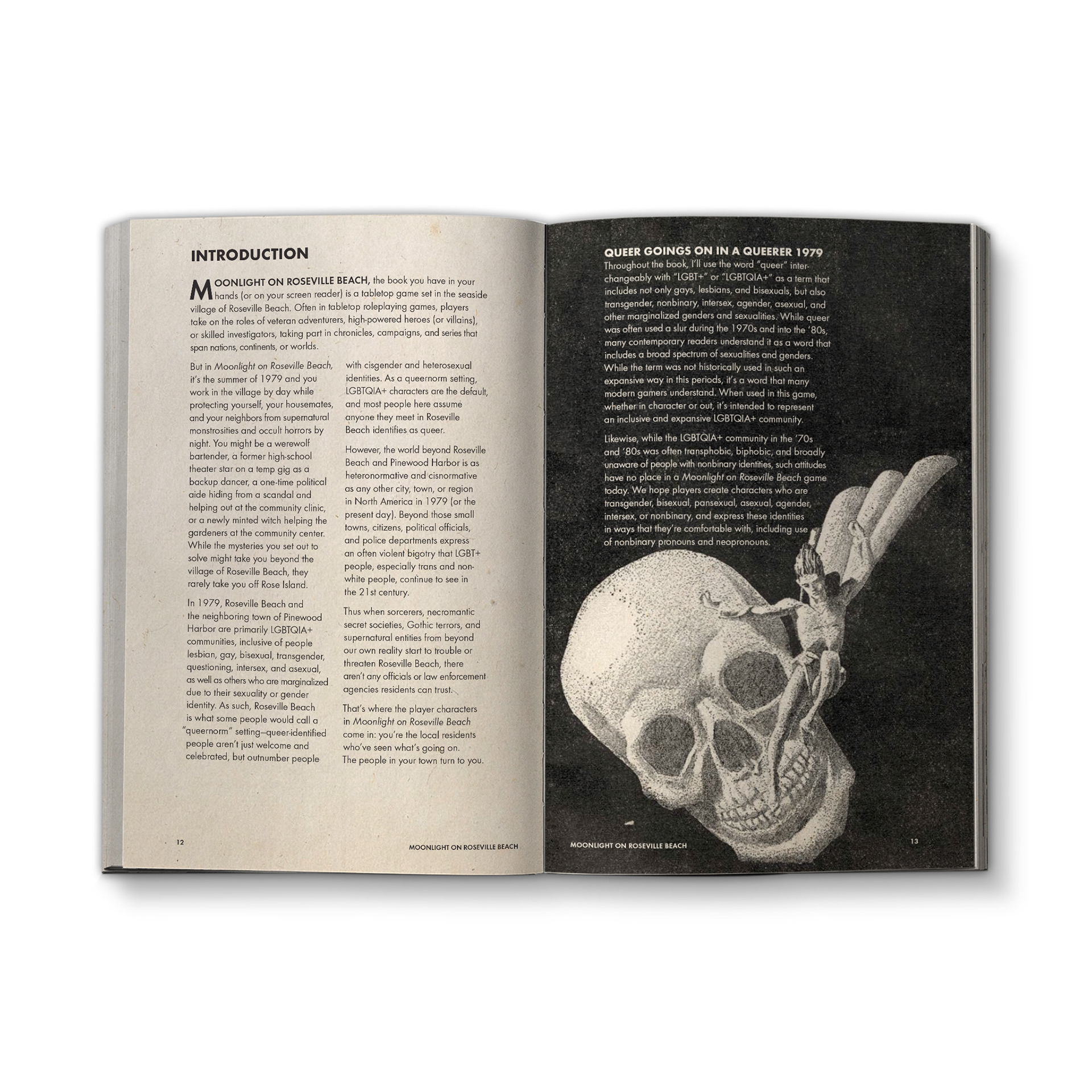
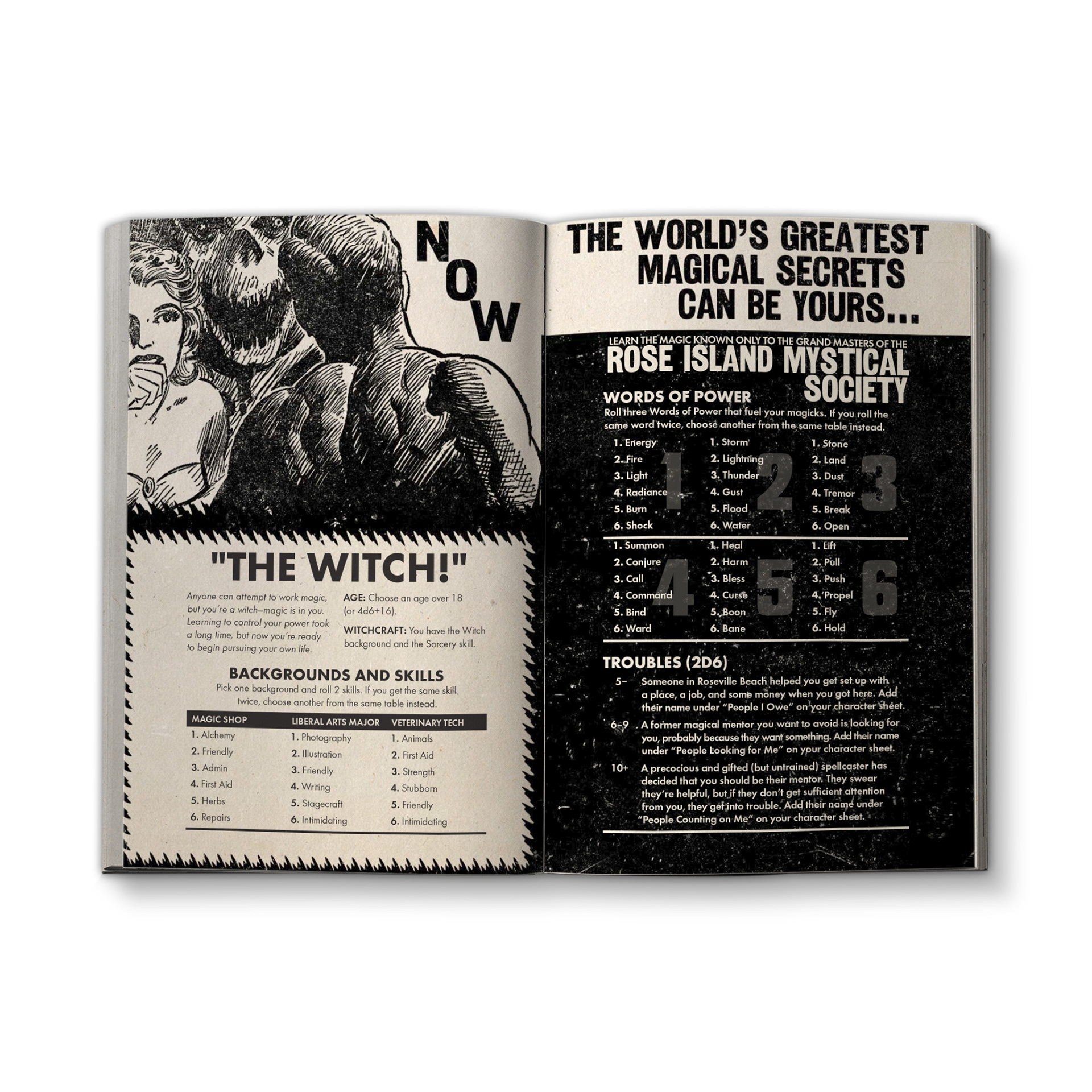
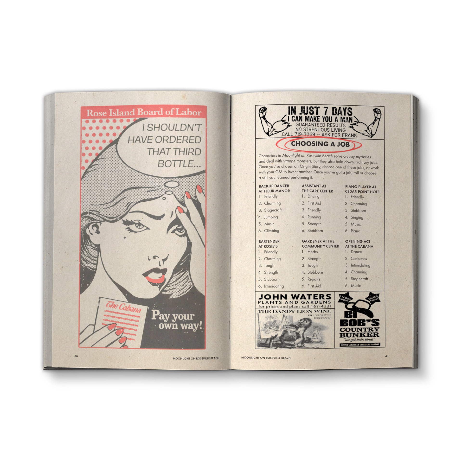
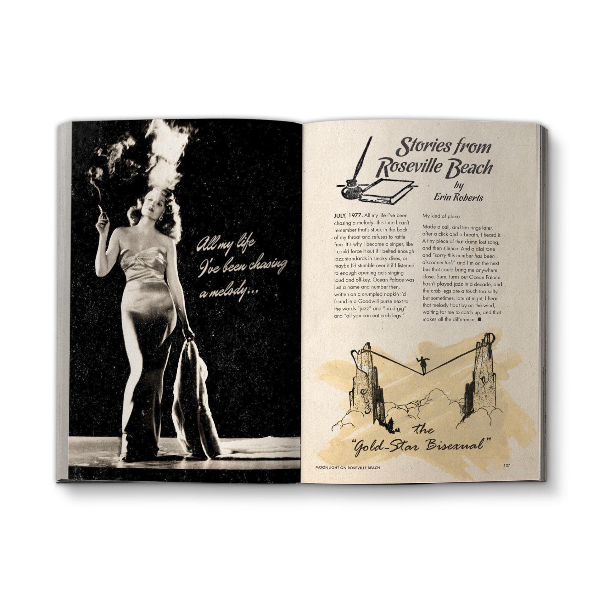
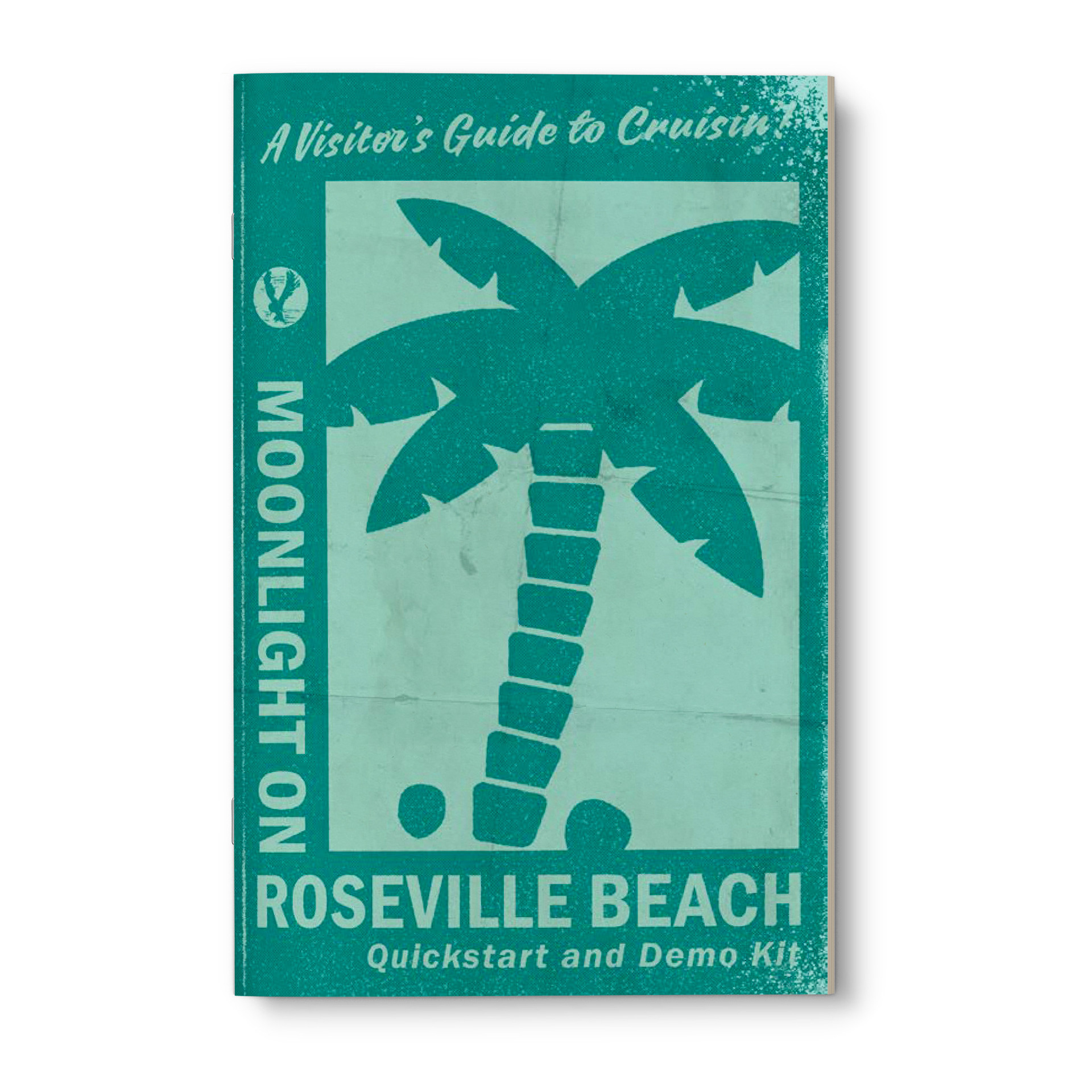
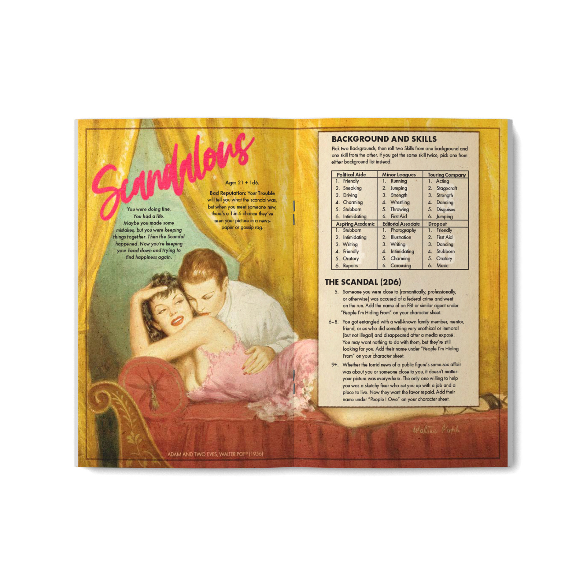
To match the pulp aesthetic, the interior of the book is set entirely in that fine workhorse font, Futura, a favorite of pulp publishers of the ‘50s and ‘60s. Empty space was filled with a variety of fake advertisements and barely-concealing jokes based on gay art and culture, maps were made in the style of travel brochures, and even the character sheet was done up like an introductory packet to the island. This was an extraordinarily fun project to work on, and its visual design is one I’m eager to revisit when the sequel, Dim All the Lights, is released.