

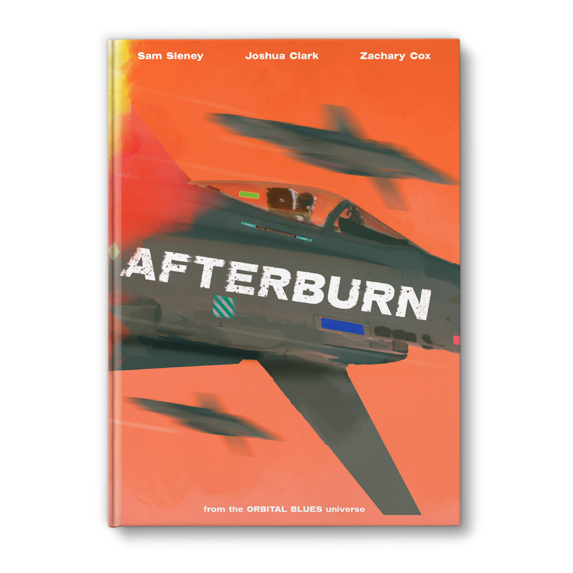
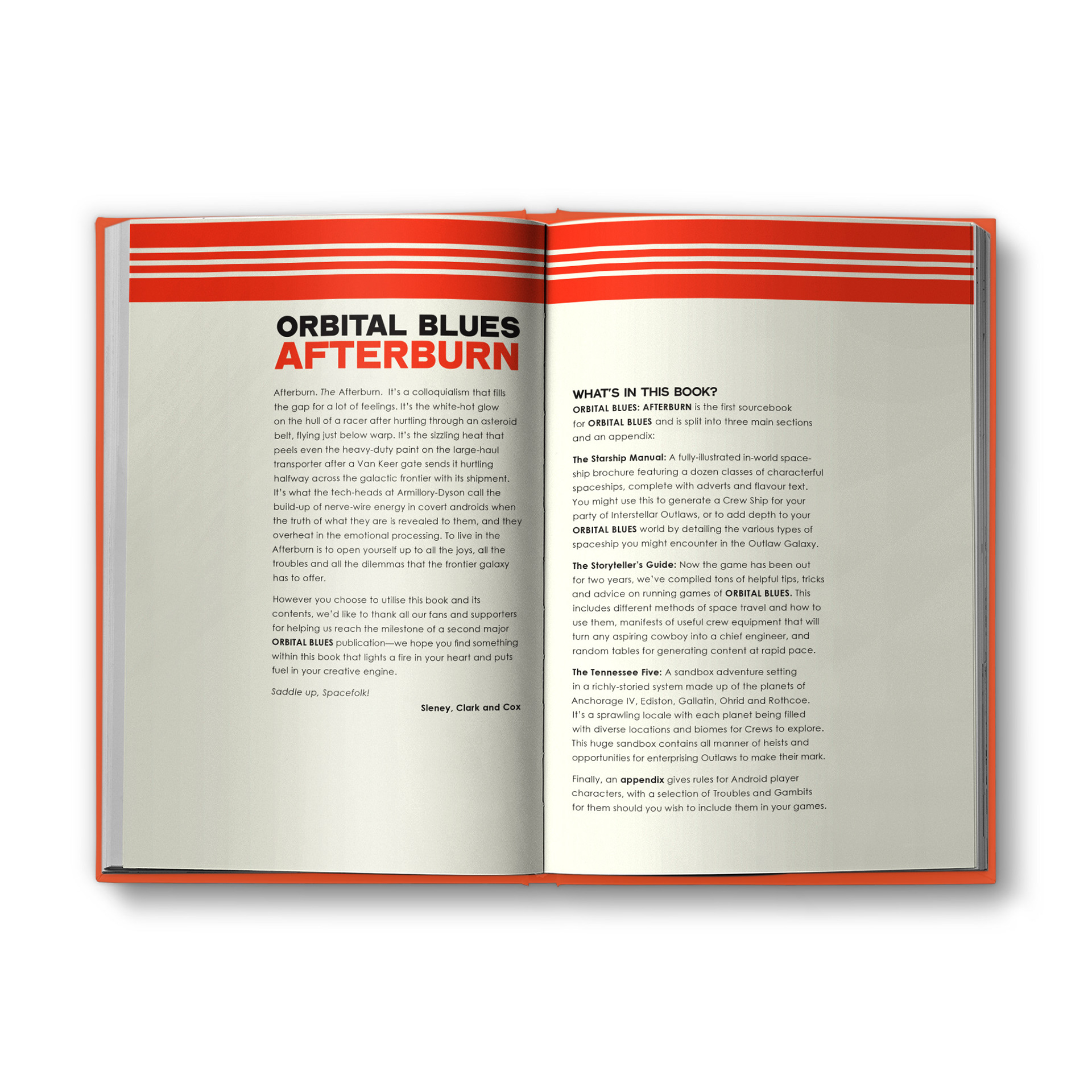
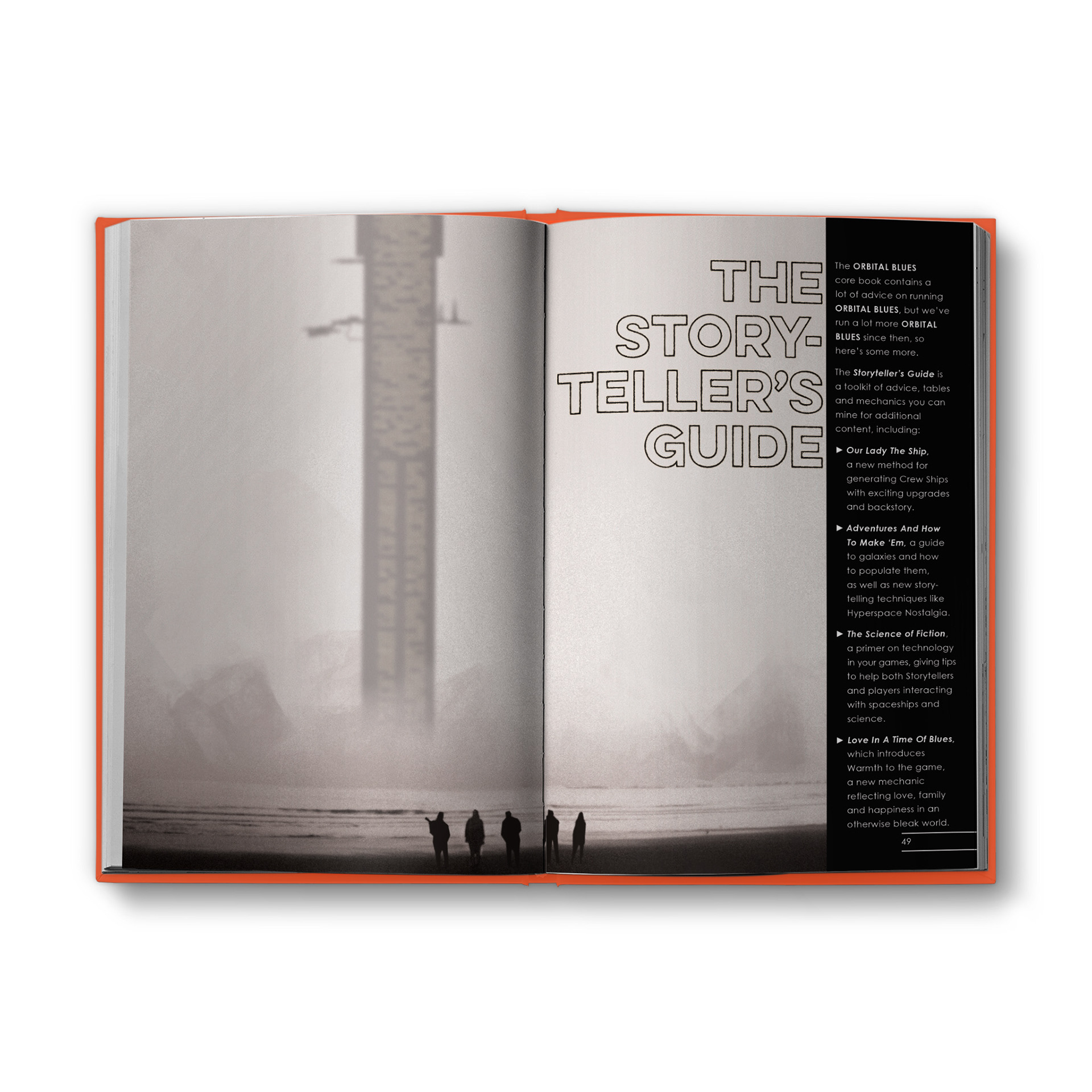
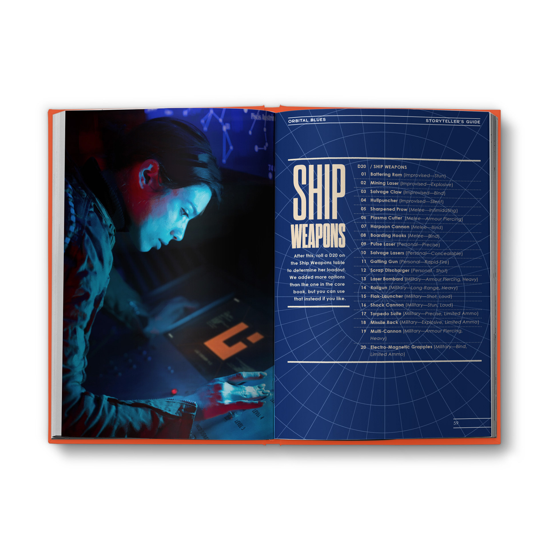
I don’t get to do as much sci-fi as I would like to, so when I was commissioned to design the hit sequel to the hit sad space cowboys game Orbital Blues, I immediately dove into the mood boards. While I’m not accustomed to following up on other people’s work, the templates and trade dress that fellow designer Lone Archivist did for the previous book were a great help in developing the style for Afterburn.
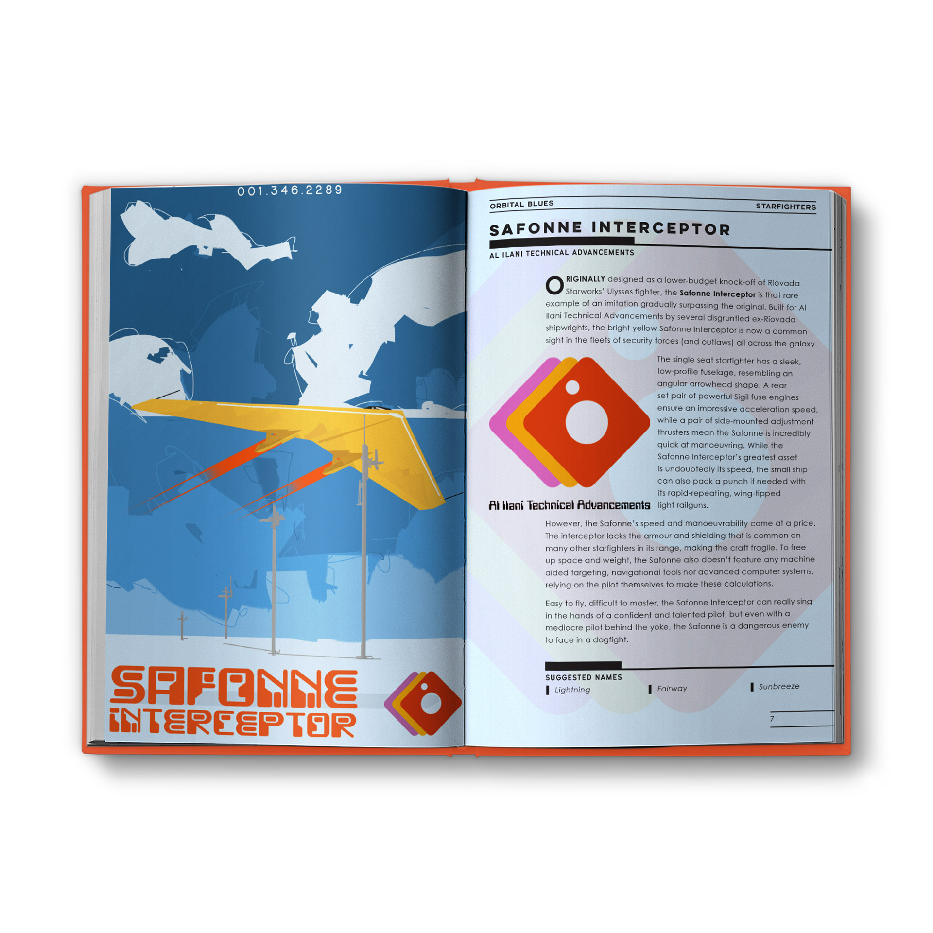
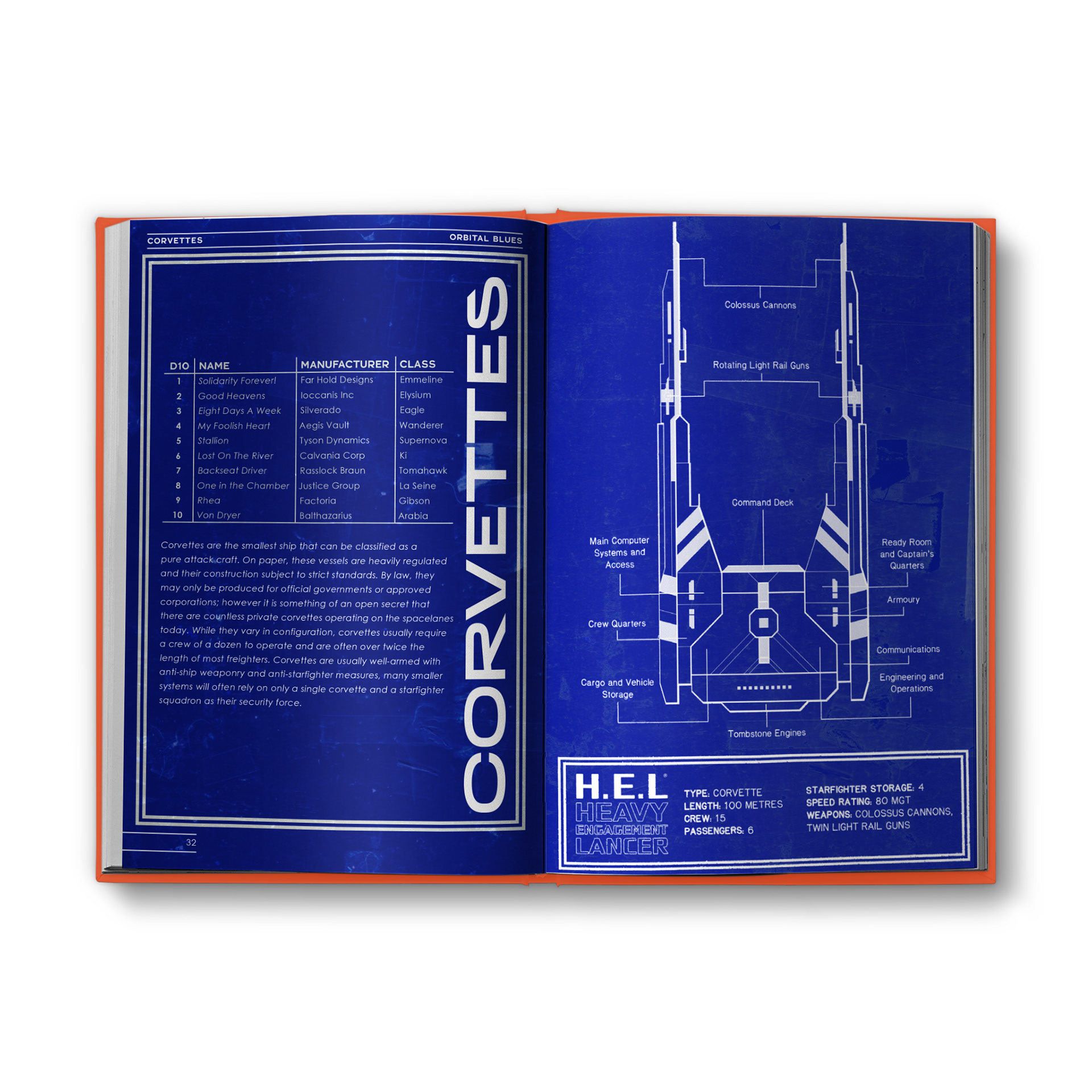
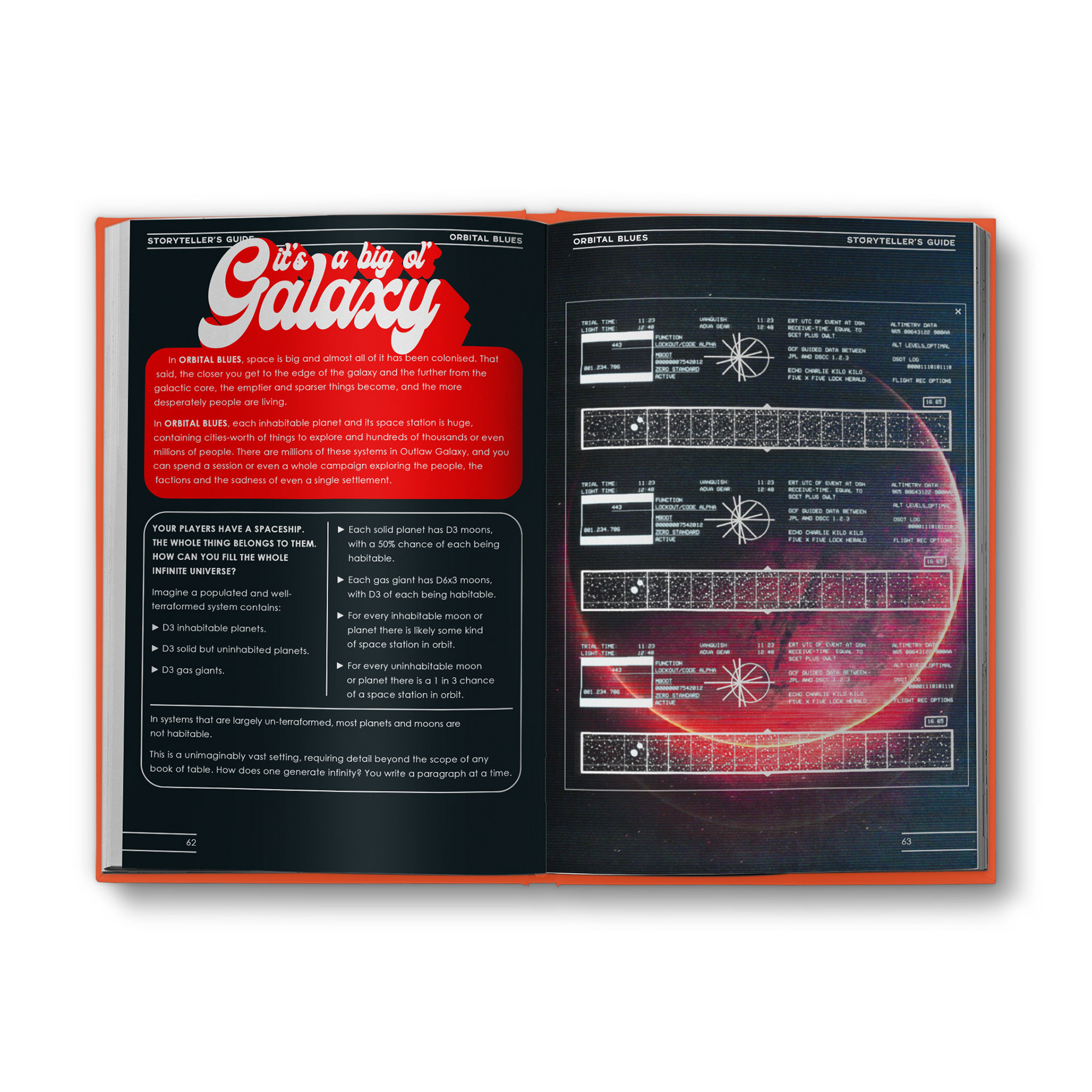
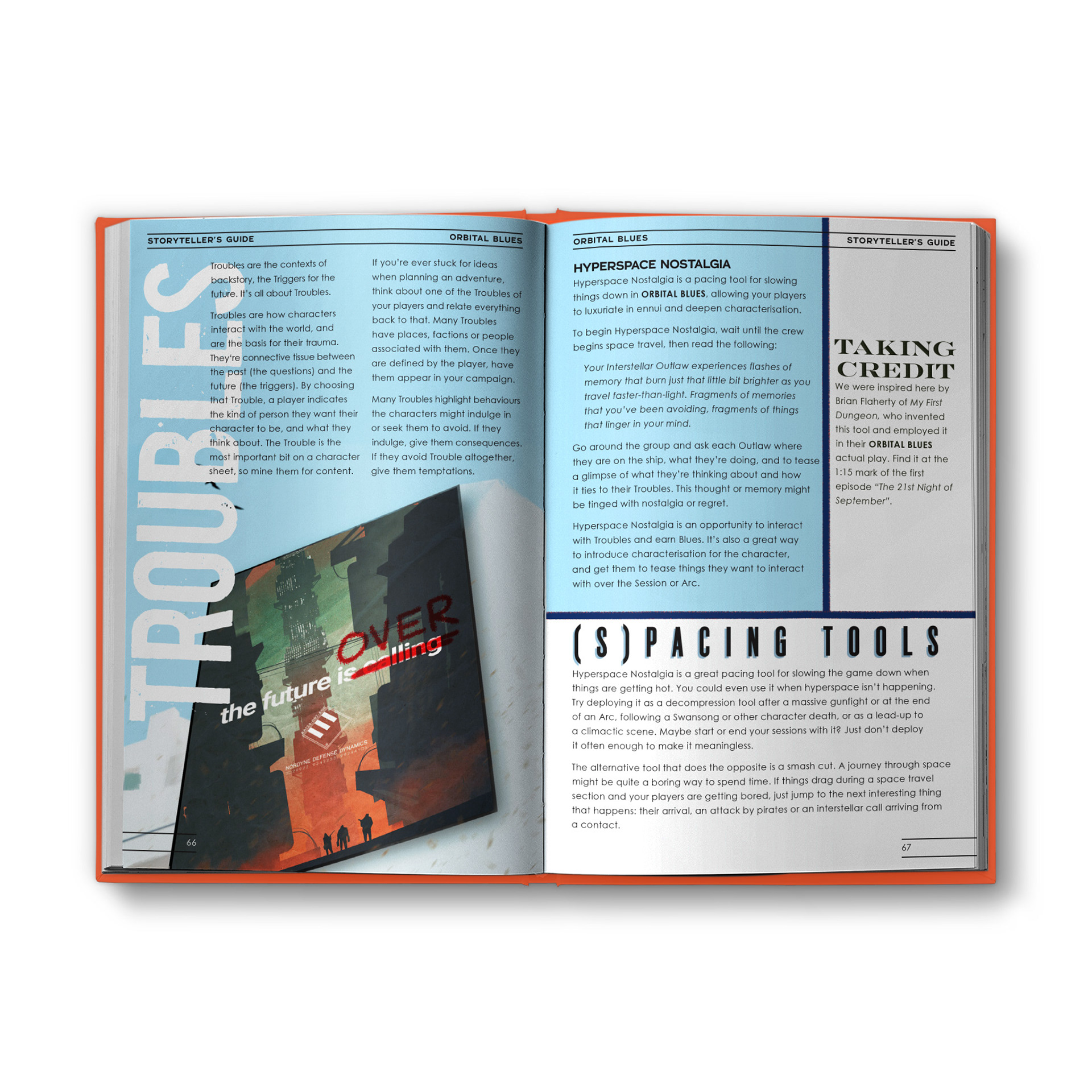
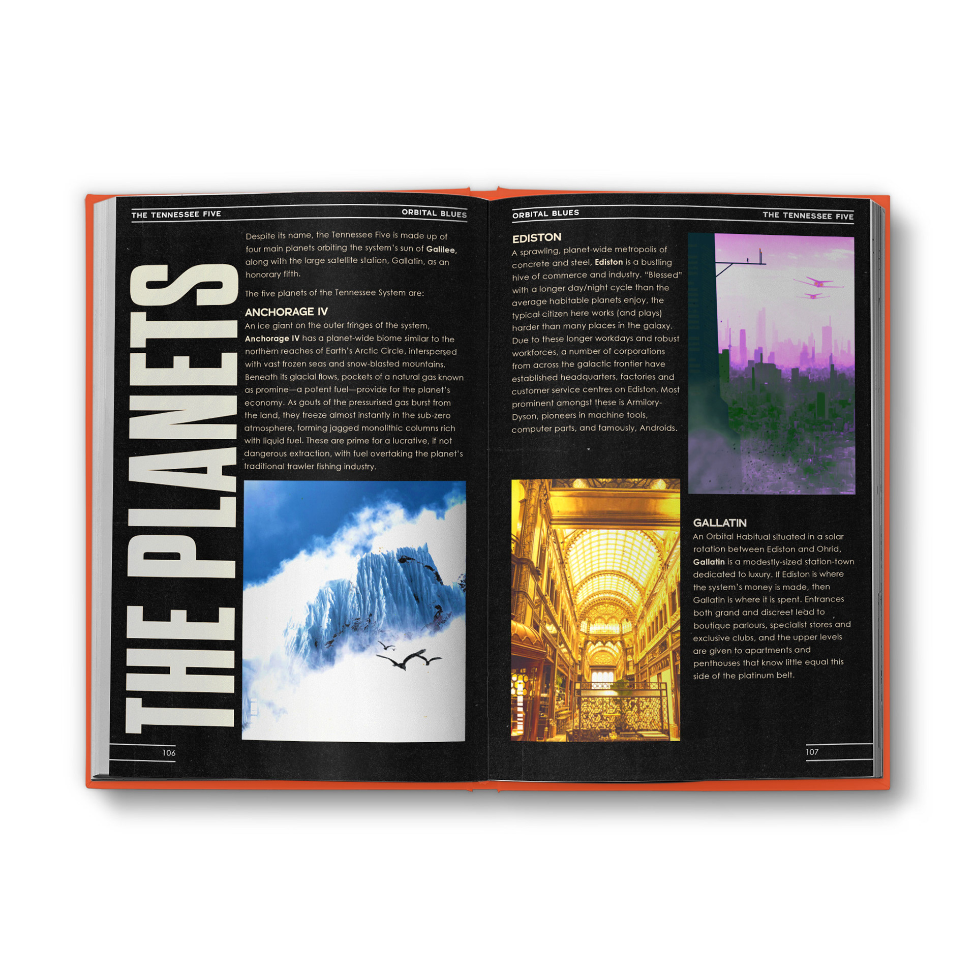
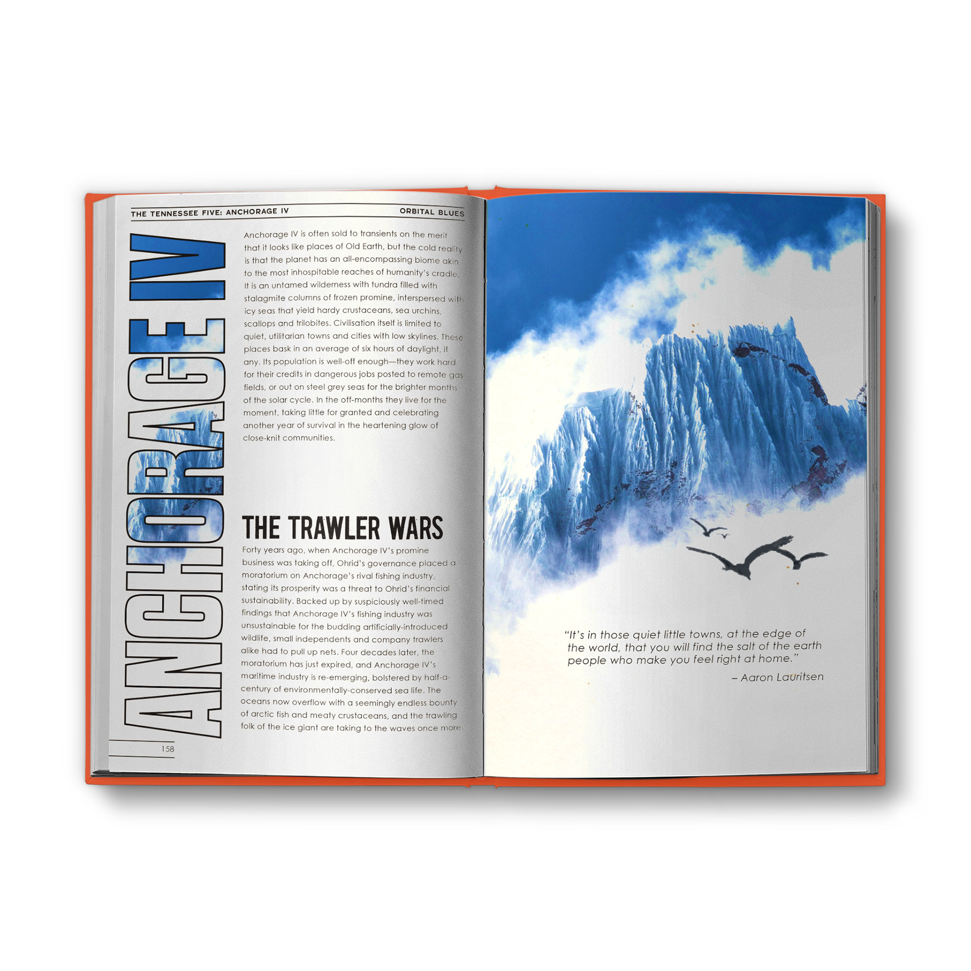
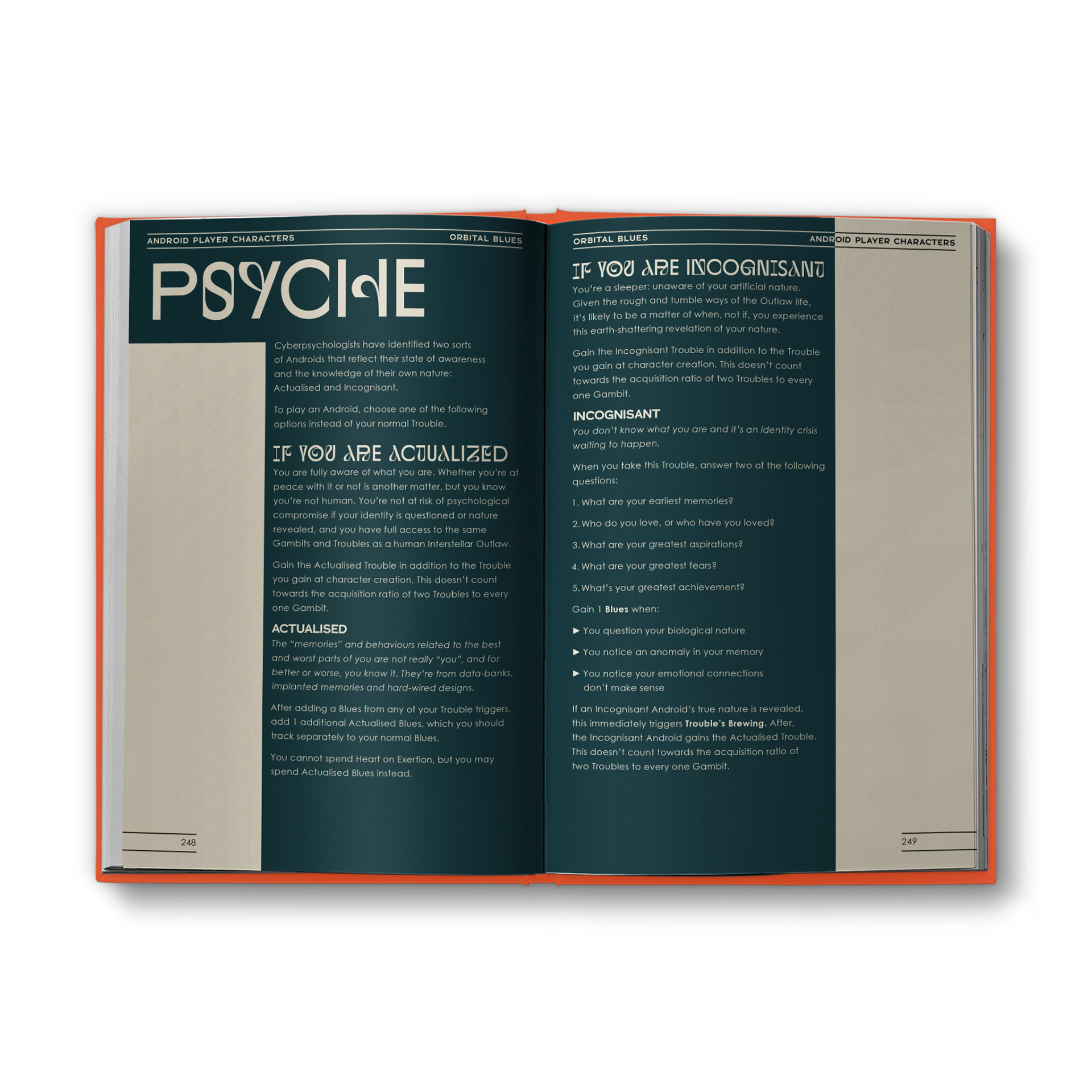
One of the most identifiable aspects of Orbital Blues is its reliance on novel display type for section headers, specifically designed to reinforce the message of the section they are attached to. So, as opposed to having a set style for every header of a certain type, the headers in Afterburn vary wildly in size, font style, and color, which was both a big challenge and a lot of fun to design. I used up damn near every font in my creator’s toolbox, and even had to hit up Adobe Fonts for more, but the result is a book where I think every single spread stands tall on its own merits.
The quality and quantity of at artwork in the book cannot be understated either. Even the pages without art often host large display type with an image fill, and generous use of the in-universe logos fill available space when they’re appropriate. This is the benefit of a good project manager: the ability to coordinate writing, art, and layout, to pull back on some areas and push forward in others, to decide whether a paragraph should be cut to save a page or expanded with a new art commission to fill a spread. I’m lucky to have had the opportunity to work with such great clients as these.
Orbital Blues: Afterburn was shipped with an assortment of extra goodies designed by other collaborators, like pamphlets, cassette soundtracks, and sticker sheets.