

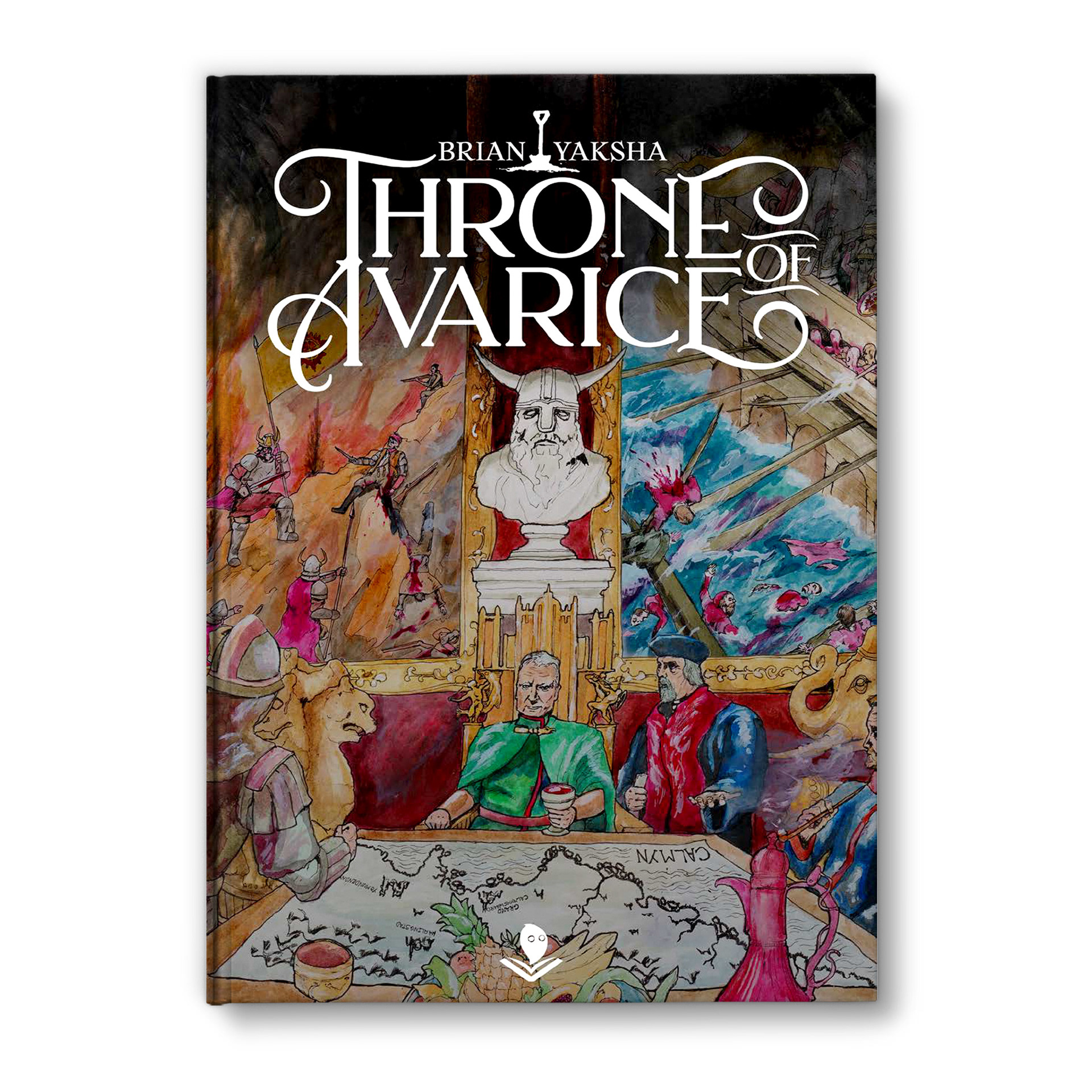
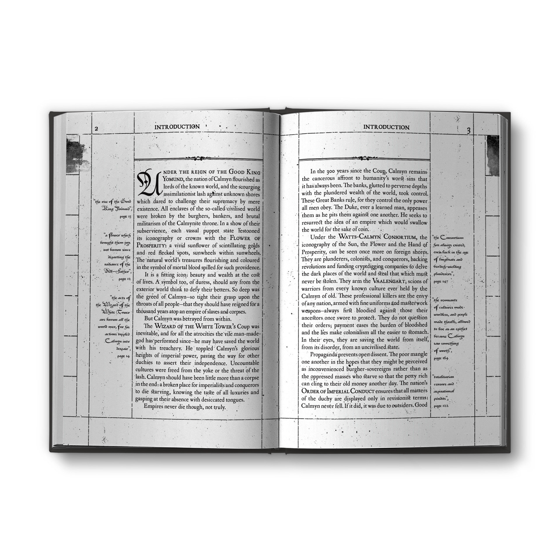
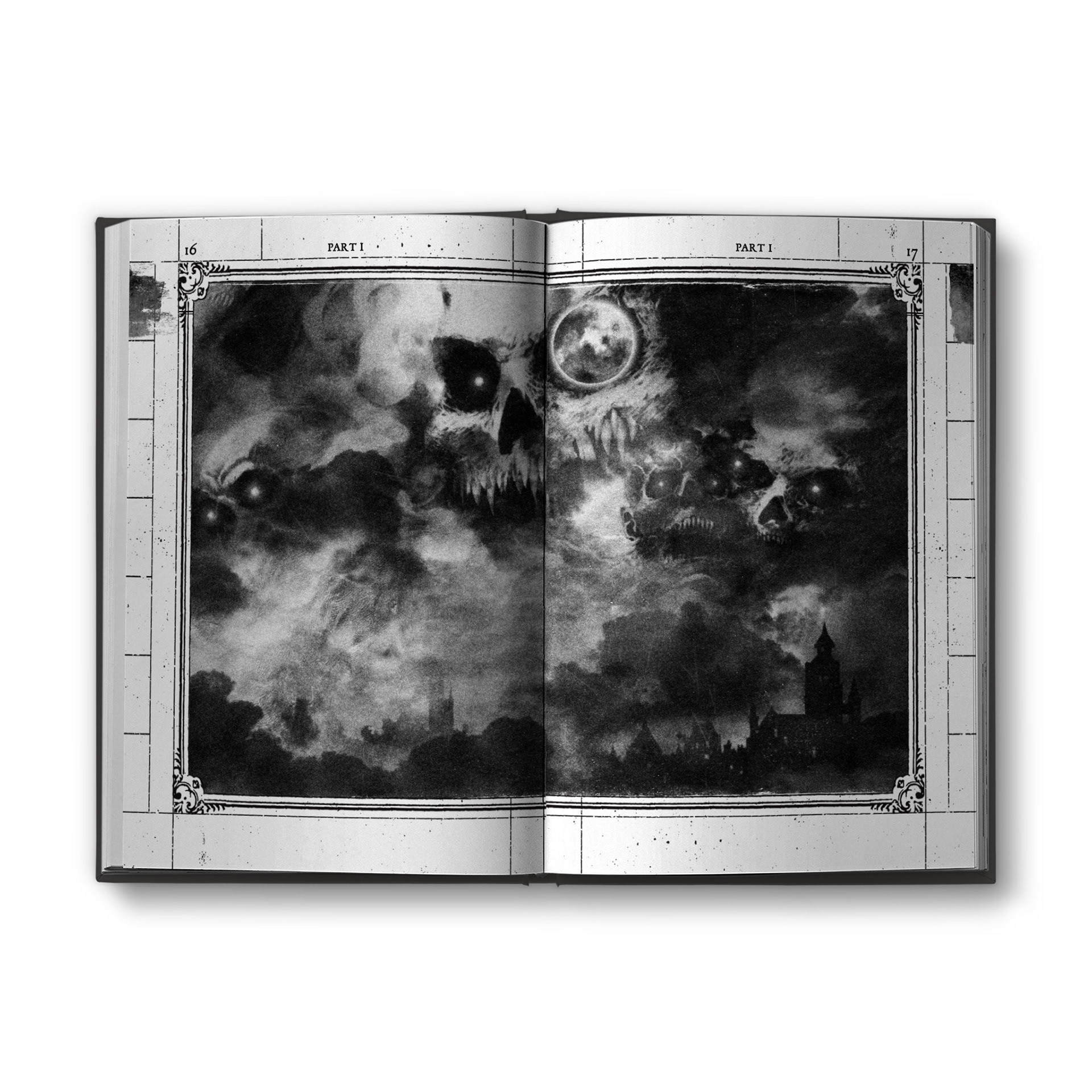
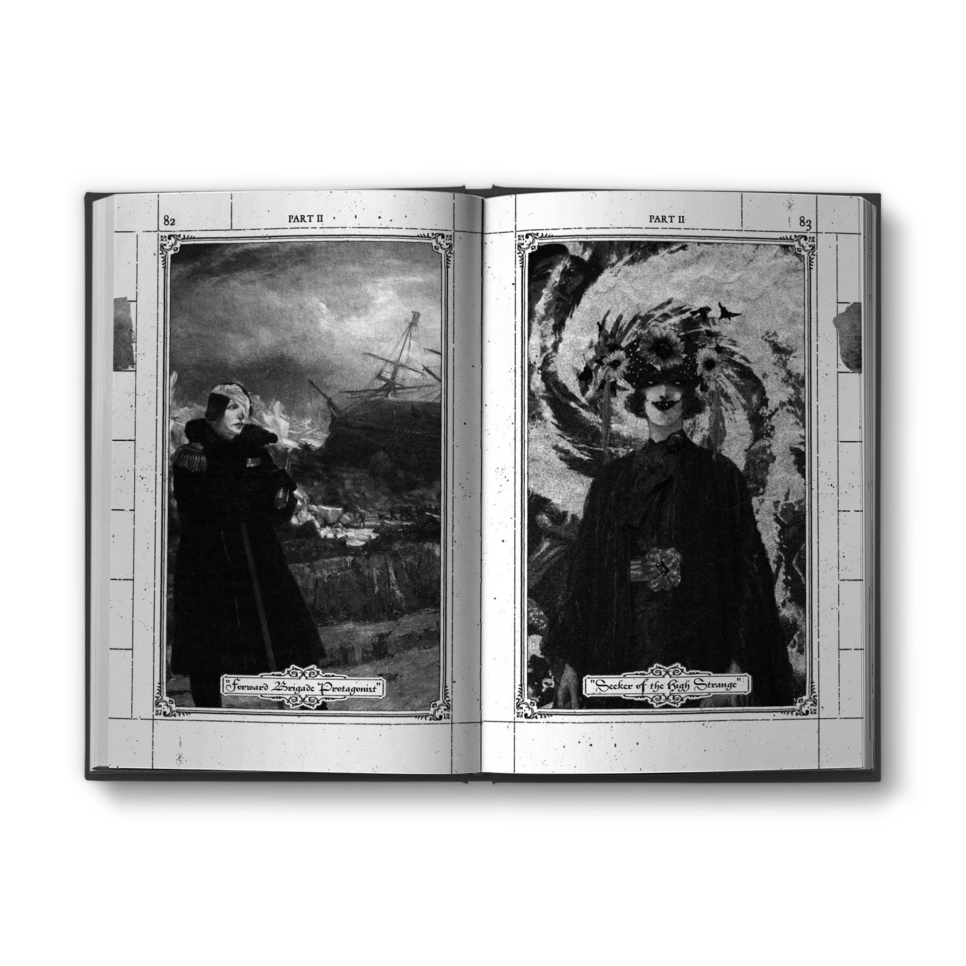
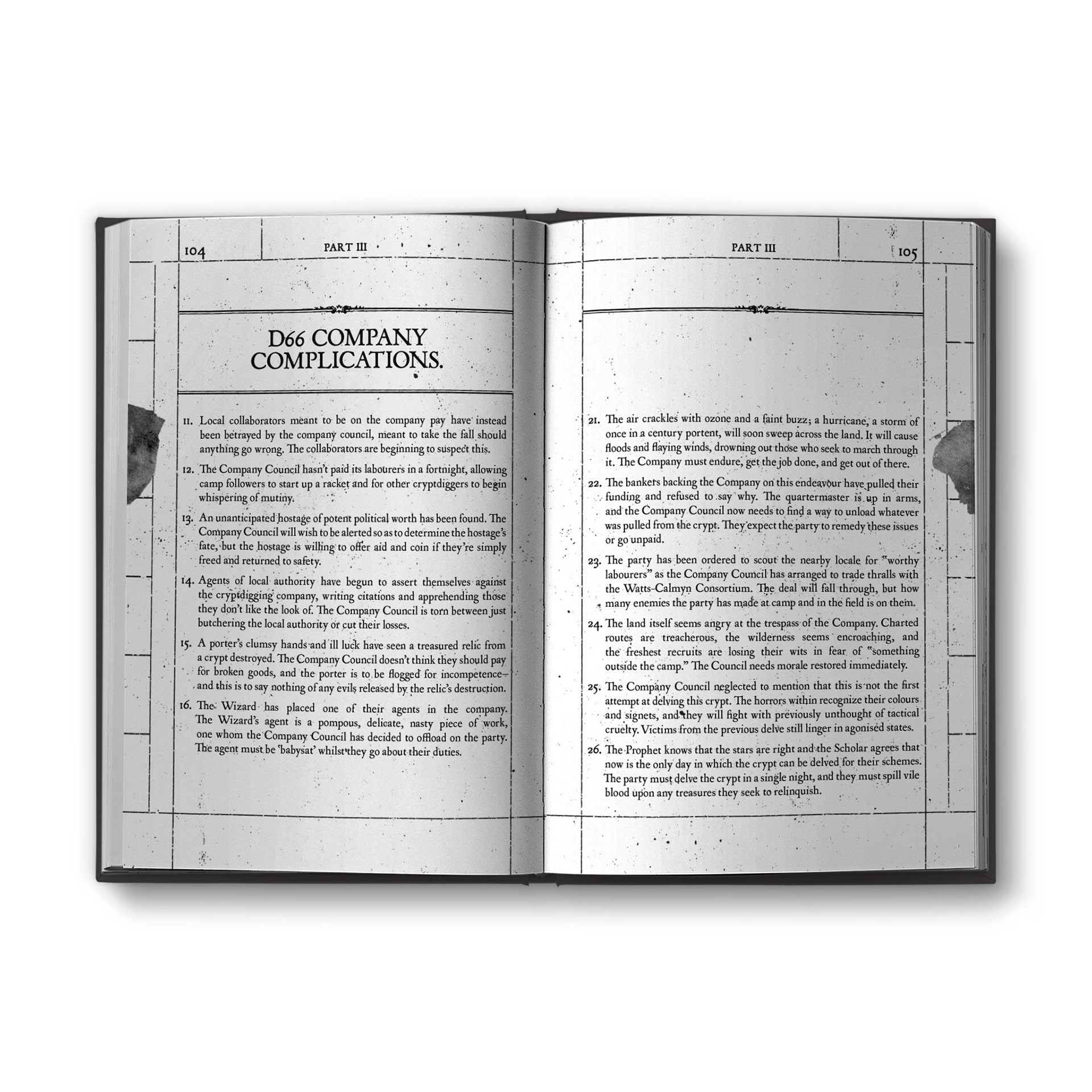
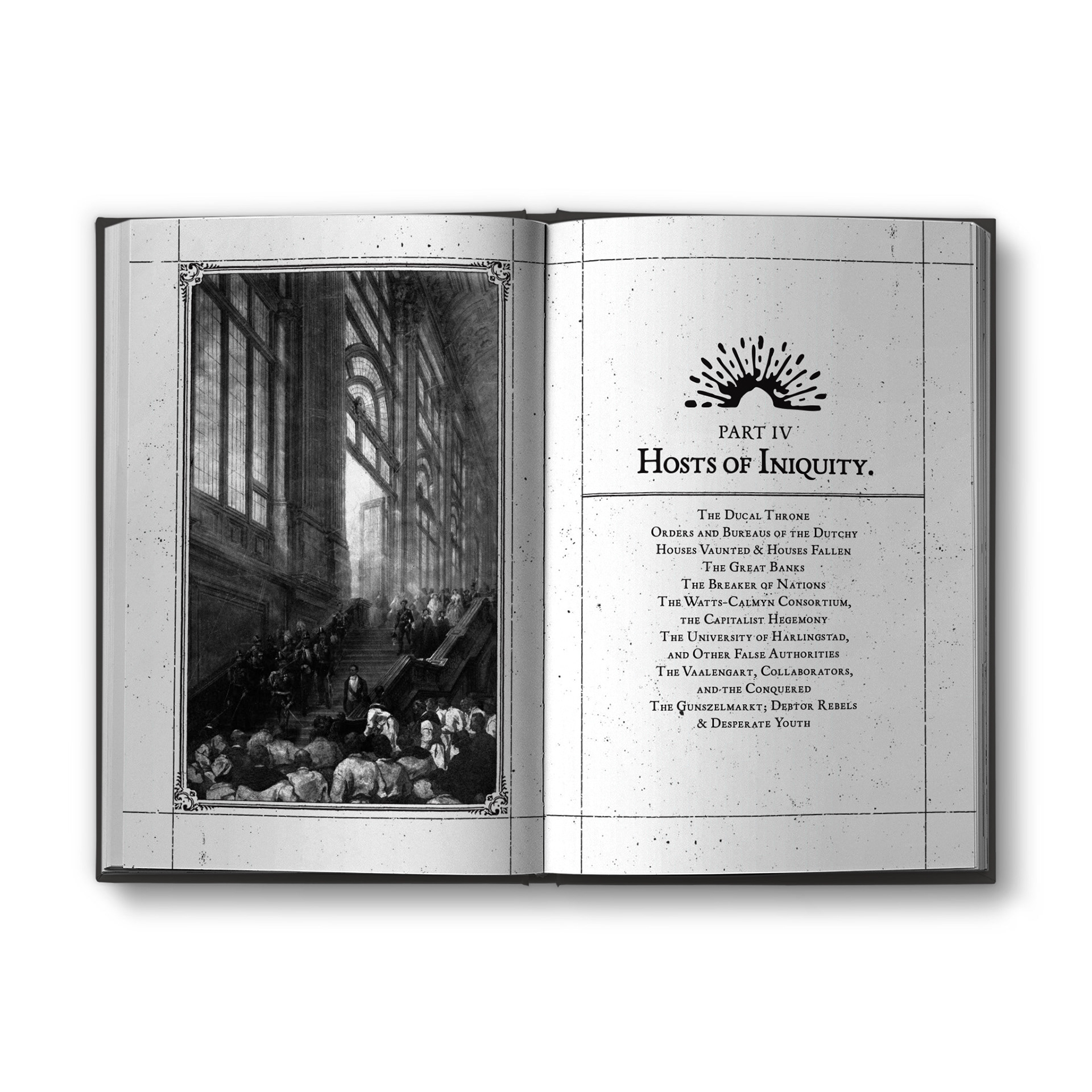
Throne of Avarice is a setting book for running games in the cold, cutthroat world of Renaissance colonialism. Far from being noble knights and stalwart adventurers, you play as gravediggers, conmen and scoundrels, one foot in the grave and one hand in another man’s wallet.
The misery and violence inherent in the system is best explained as an attempt to portray the real living conditions of those under the yoke of the various East India companies of the 17th century. Jan Middendorp’s excellent book Dutch Type was invaluable in my research of this era, and I would come to settle on using two typefaces for the project: P22 Mayflower, which is based on the printing of a cheap bible brought about the titular ship, and Civilite, an early attempt by Robert Granjon at making a calligraphic in metal type. While It never took off the way blackletter did, it did see some use, particularly in Antwerp where Granjon's apprentice Van den Keere worked alongside Christophe Plantin.
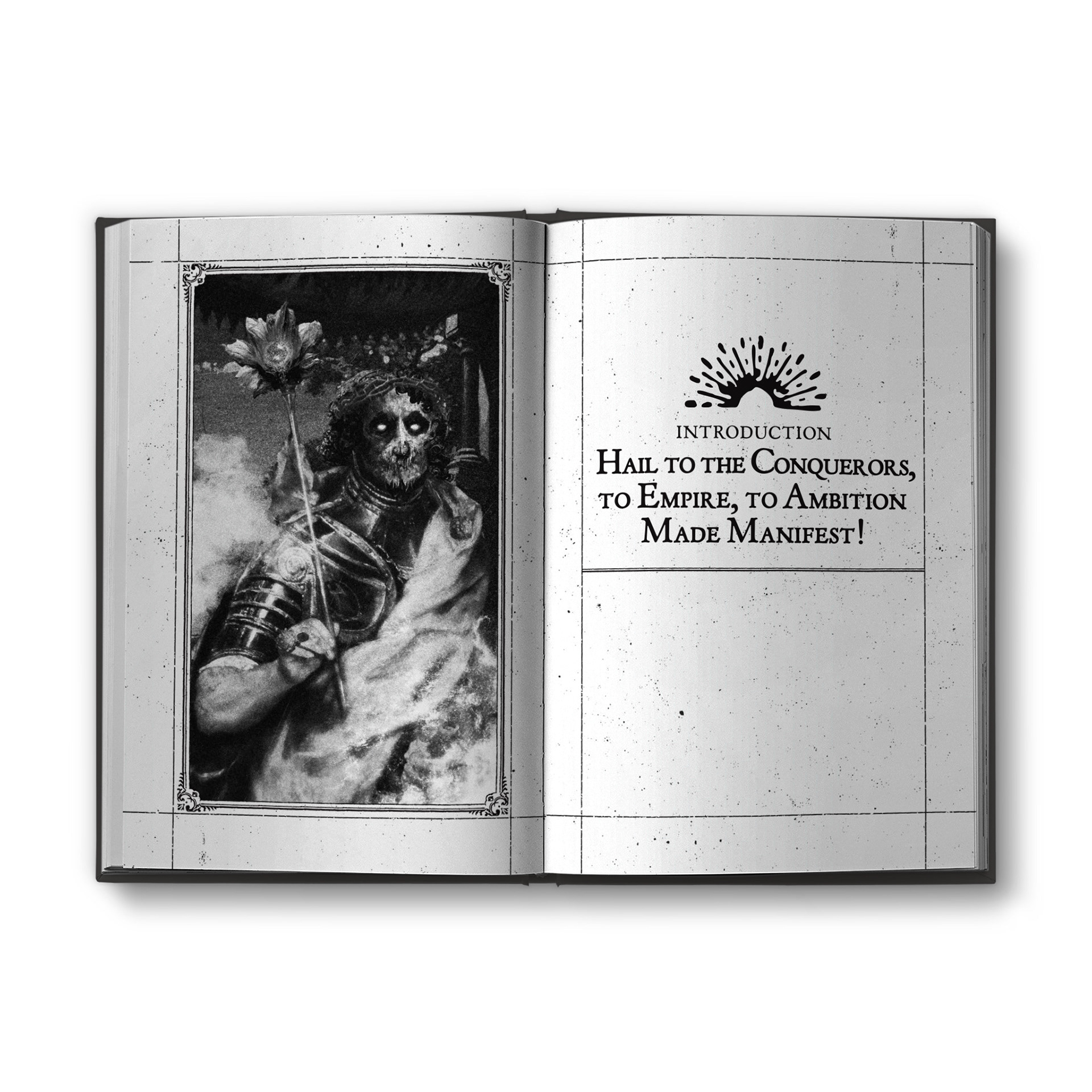
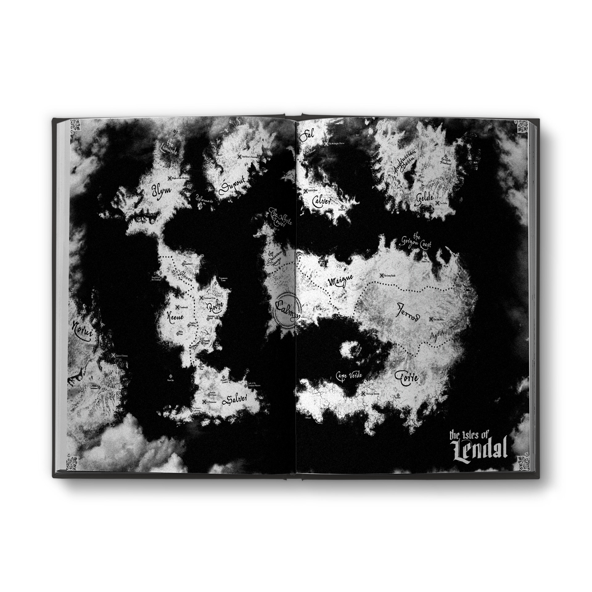
These fonts were matched with a modular grid that allowed for 1, 2, or 3 columns as necessary to fit the material. As I was researching the India companies, I also came across several examples of ship’s logs from the time, which worked perfectly with the preponderance of tables in the book. A visible grid, some page weathering, and a running sidebar abstractly showing the current chapter completed the aesthetic, giving the entire book the authentic appearance of an ancient tabulation dredged from some doomed coffin ship.
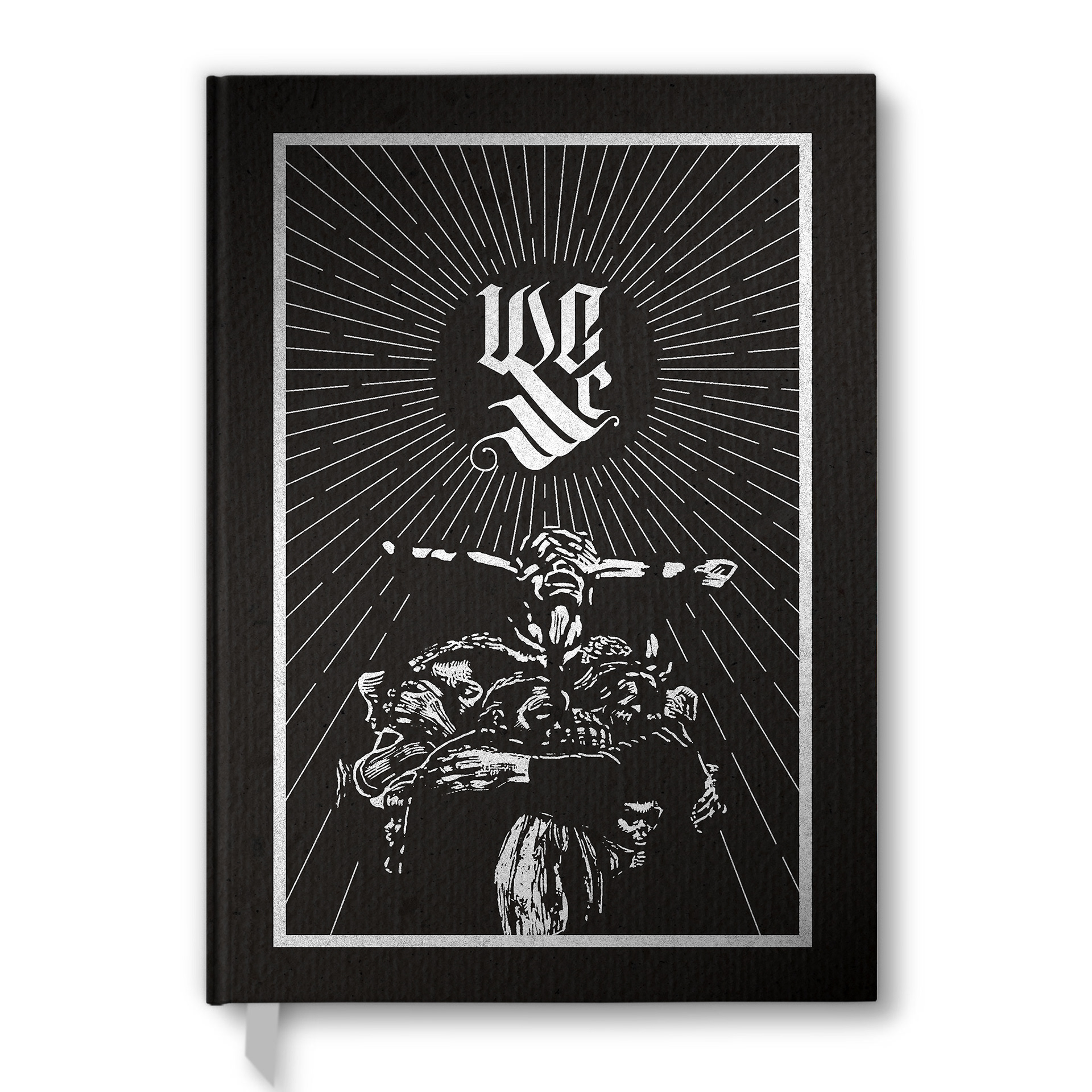
Like Gangs of Titan City, Throne of Avarice had an alternate, special-edition cover designed by myself. To echo the kitbashed art of Brian Yaksha, this cover utilized two illustrations by German expressionist Käthe Kollwitz, showcasing the abject suffering and propaganda that fills the life of the average Calmyn citizen.