
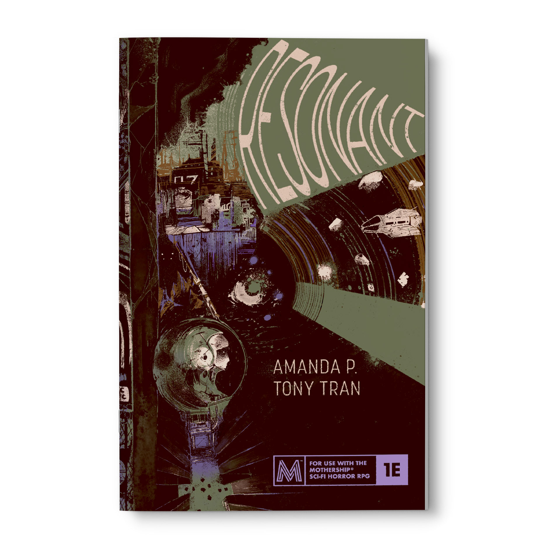
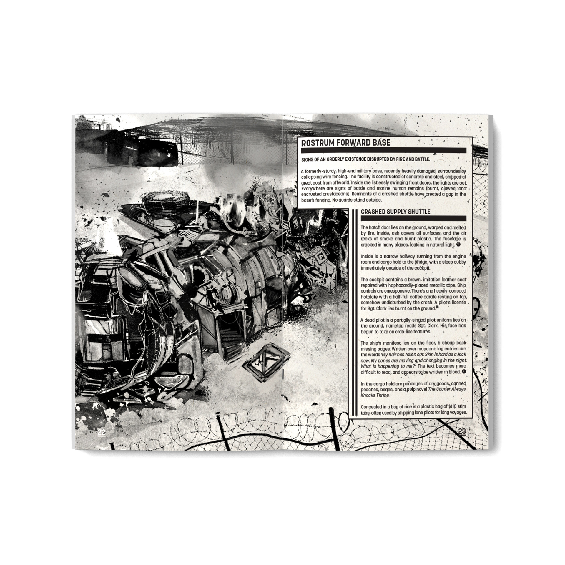
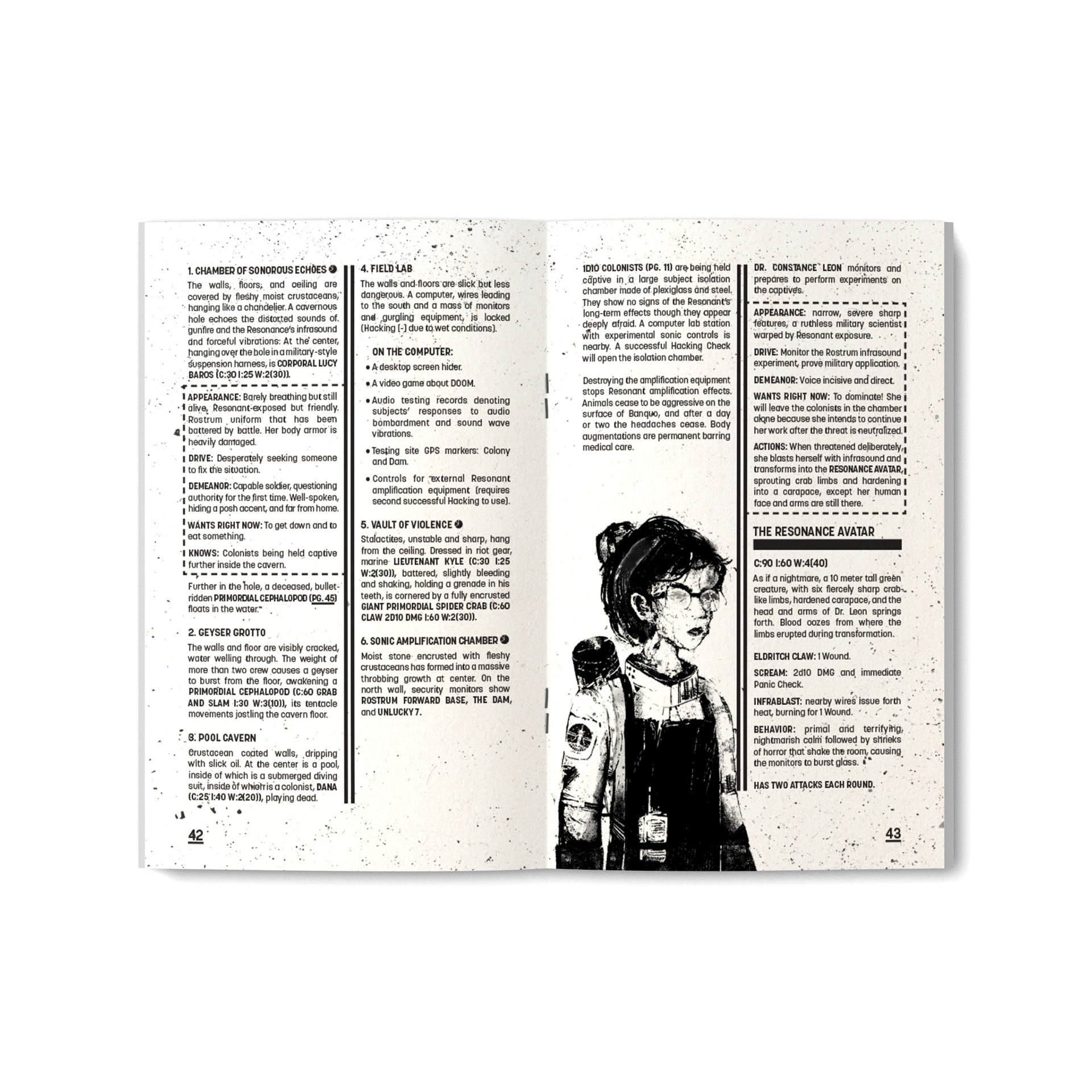
In addition to handling the social media and marketing side of Space Penguin Ink, I’ve also been privy to designing some of their adventures. RESONANT by Amanda P. is a MOTHERSHIP module about corporate greed, private military atrocities, and experimentation on civilians. It’s heavy stuff, and I wanted the design to reflect that: it’s gritty, like the whole book’s been scoured with sandpaper. Text and art are crushed together and laid on top of each other, because there’s just no room to breathe. The only color in the module is in the covers and endpapers; once you’re inside, there’s nothing but shades of gray.
As a designer, I believe in balance and harmony. A loud design on the page must be balanced by simple, readable typography. RESONANT uses one typeface and one typeface only: Korolev, based on an anonymous typeface found in photos of the Red Square in communist Russia. It’s a typeface that designer Rian Hughes describes as “a ruler-and-compass sans with an engineered elegance.” Just the thing for a book about the horrors of dehumanization.
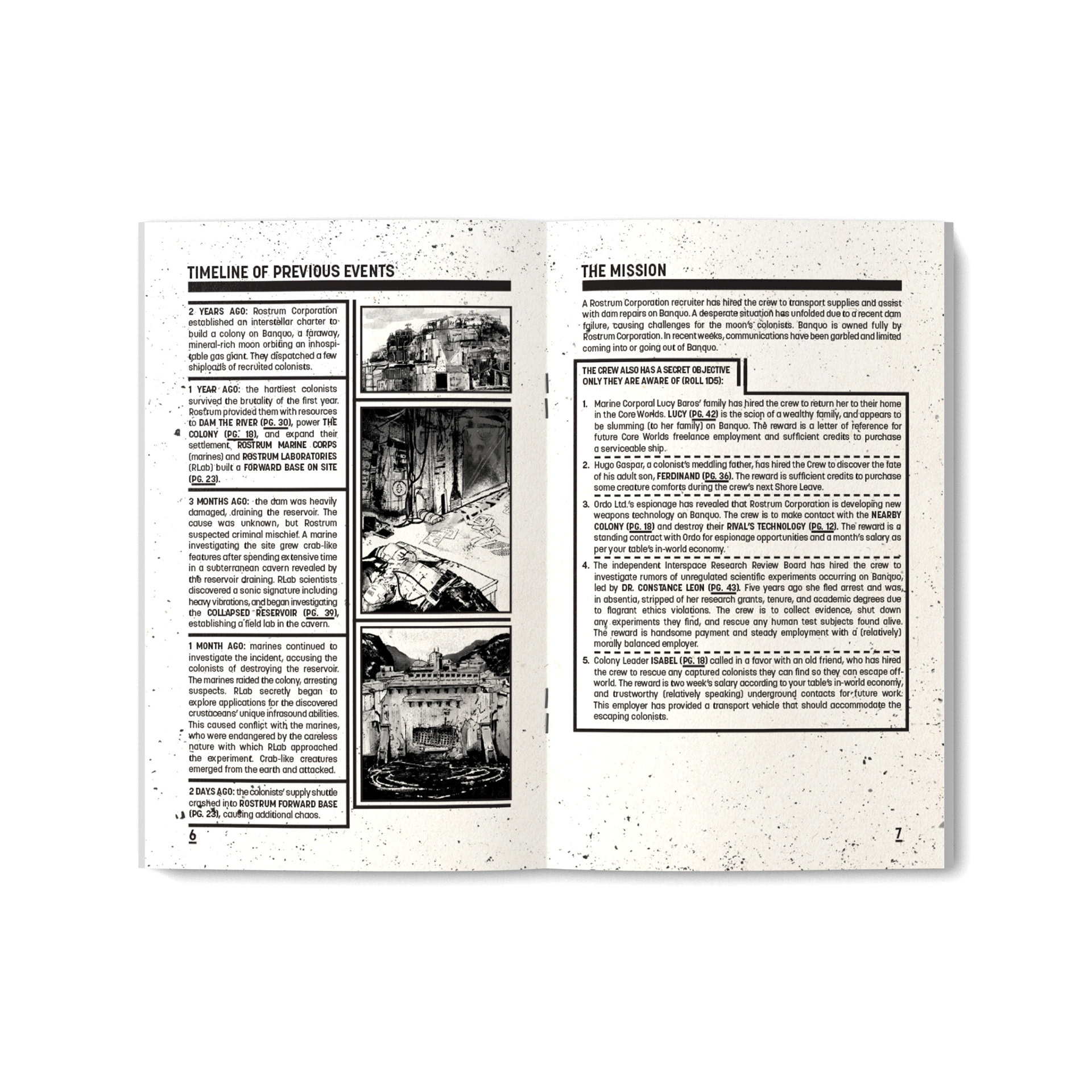
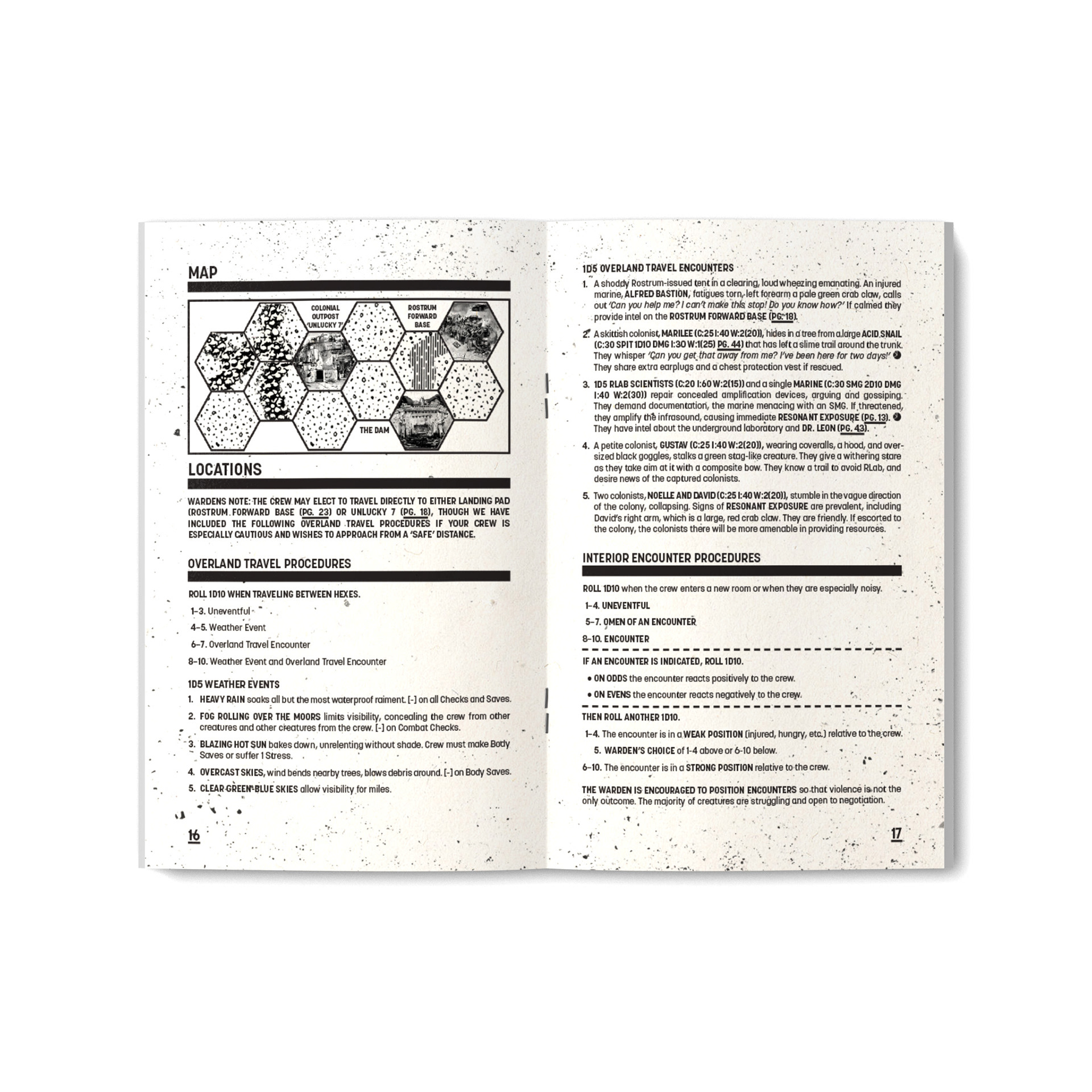
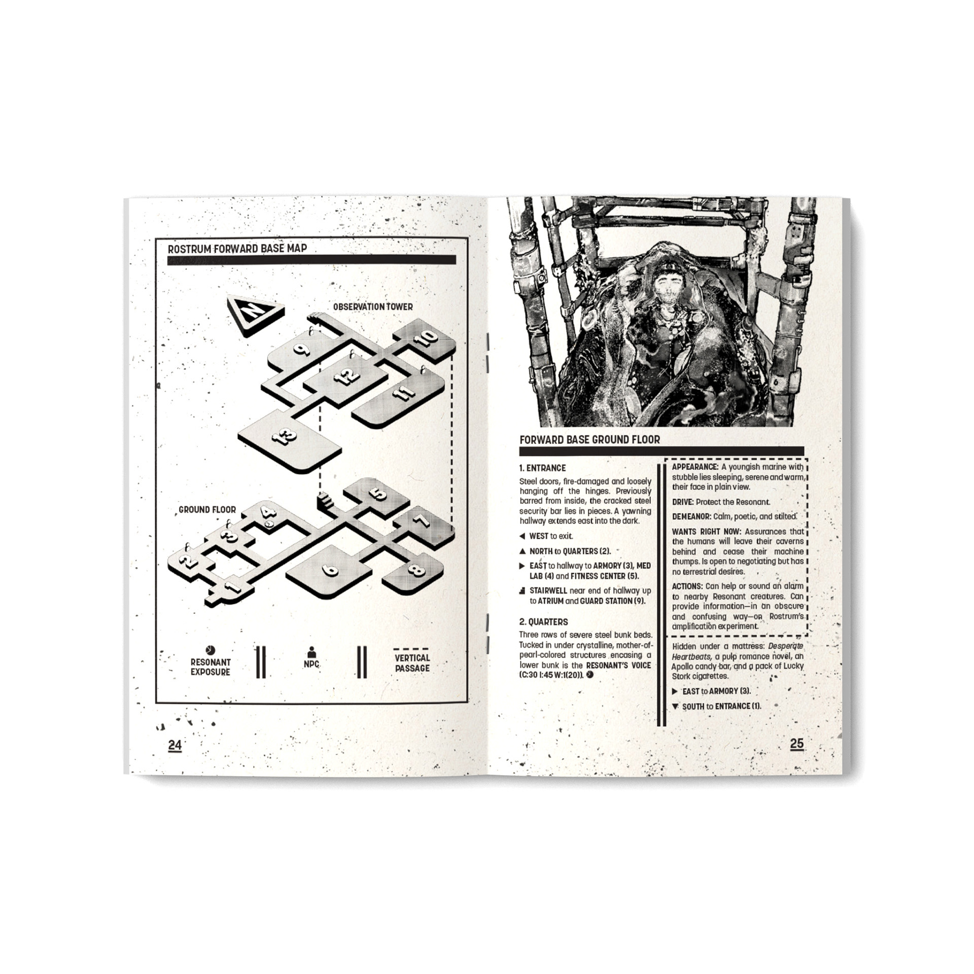
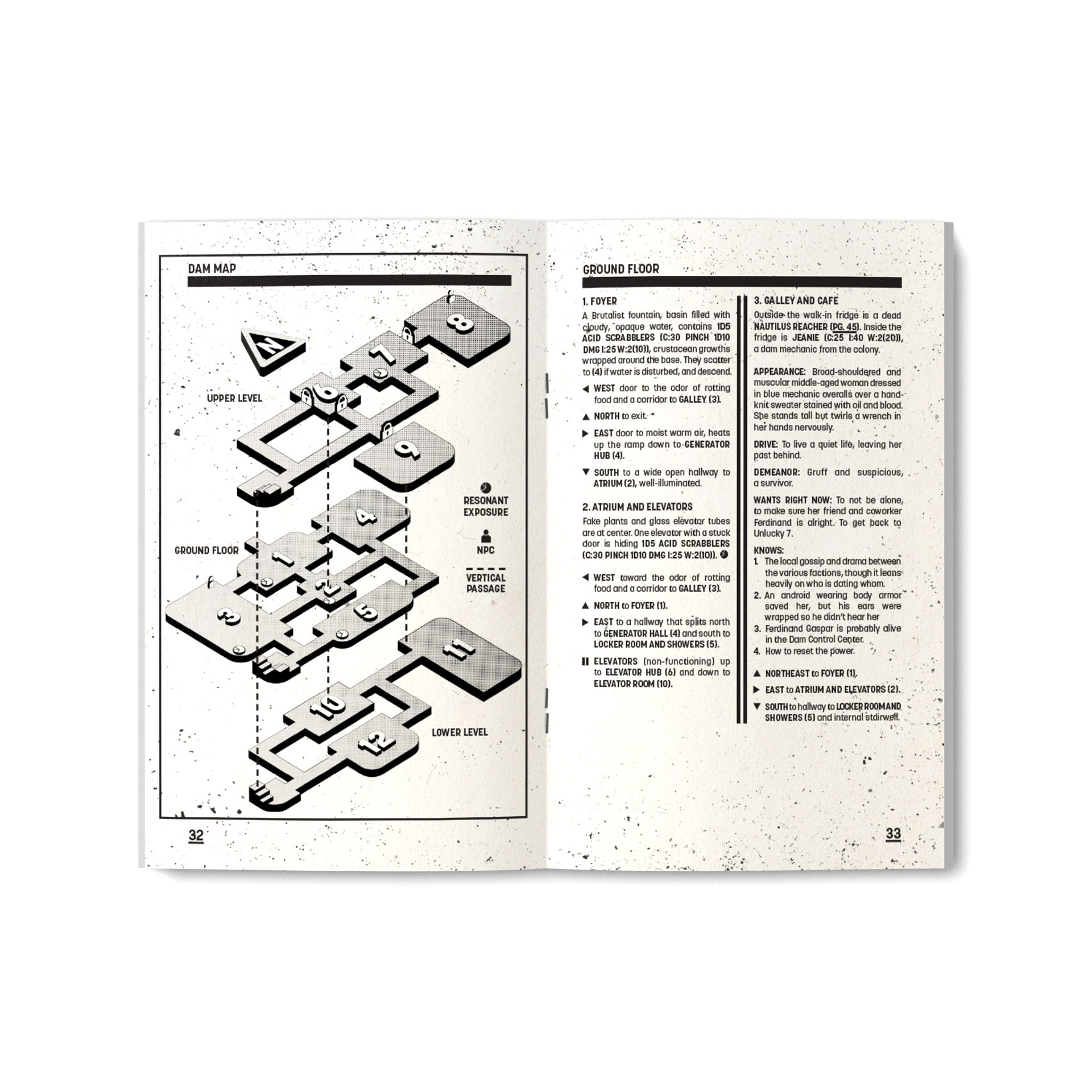
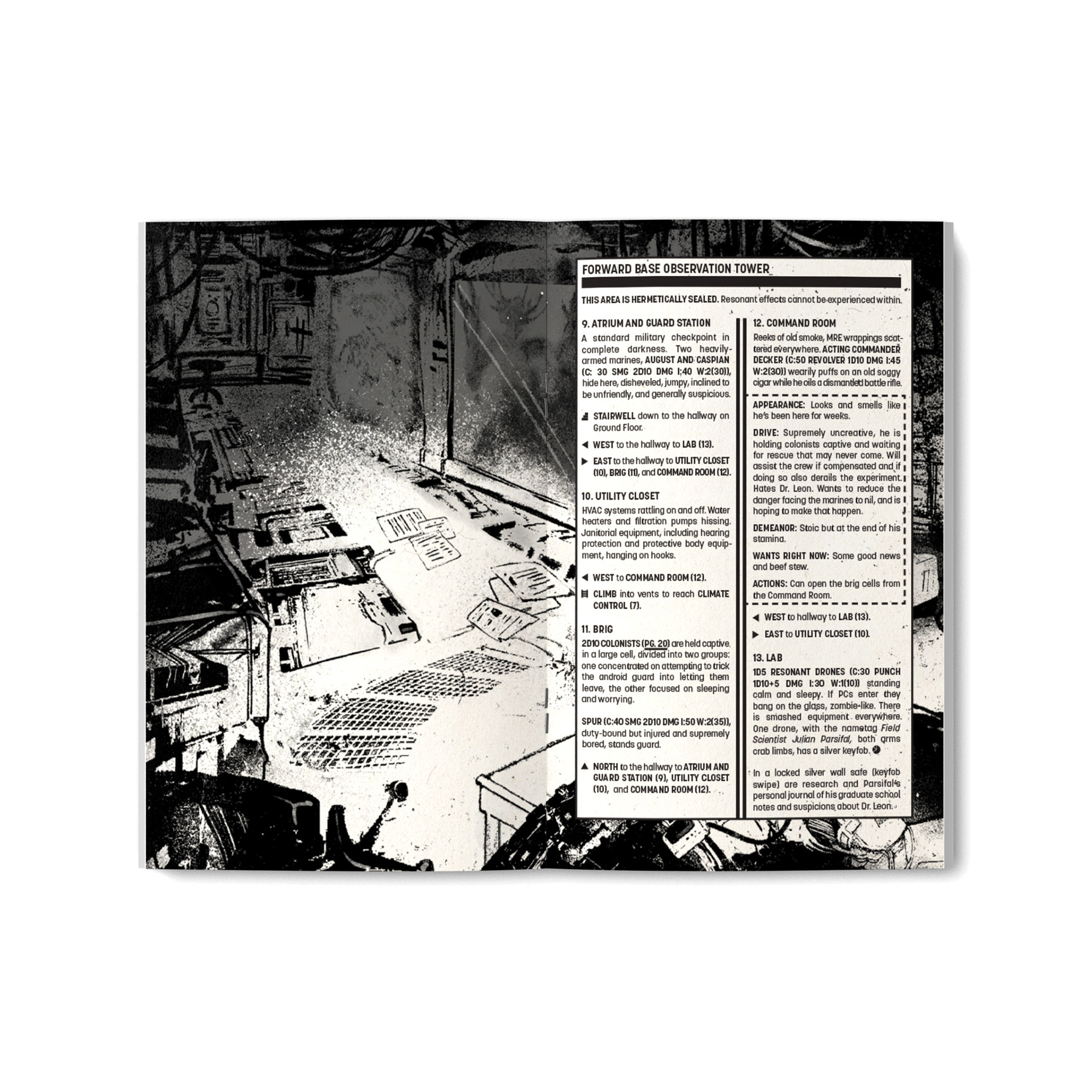
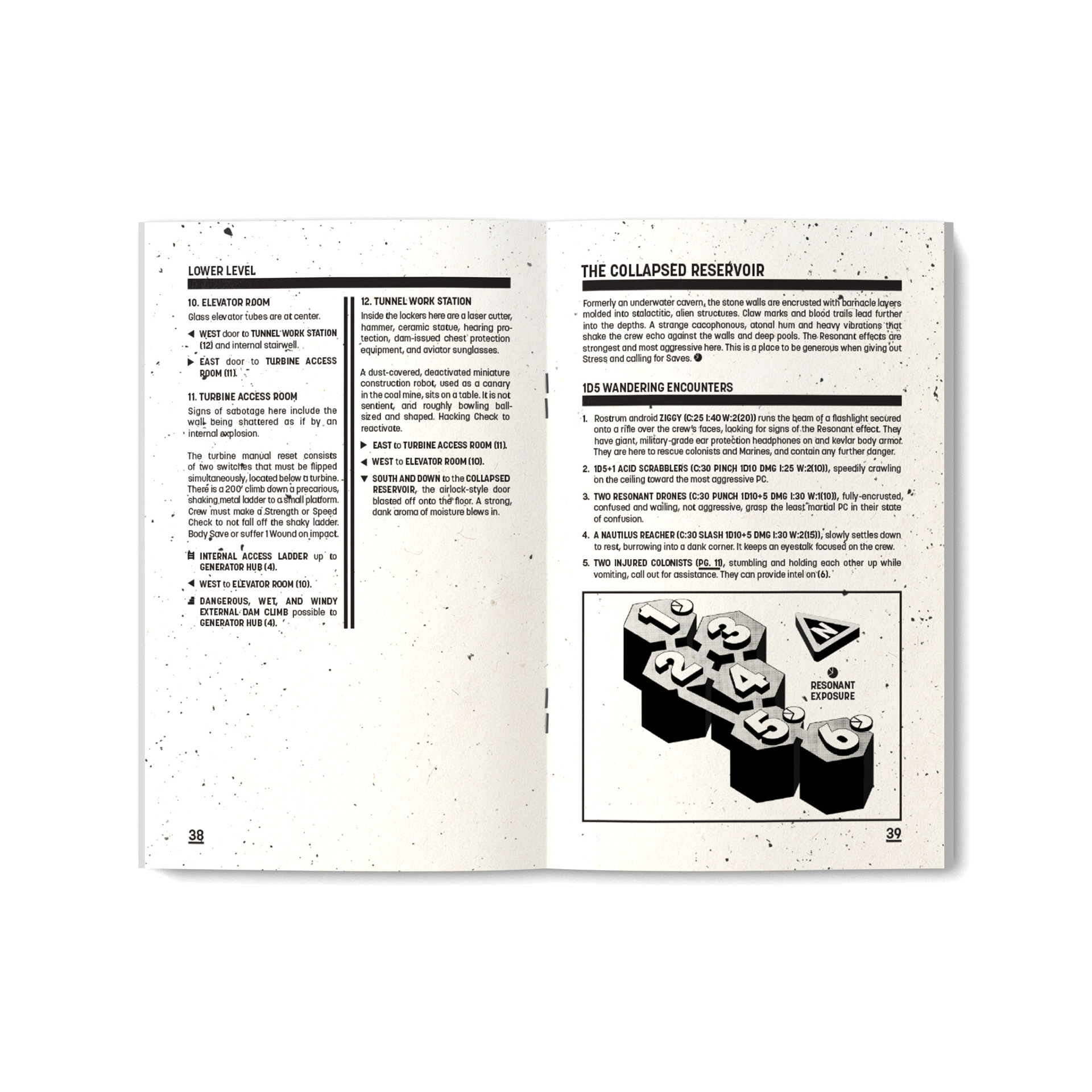
The heavy strokes under the headers and between the columns were similarly inspired by early 20th-century Russian design, and the isometric maps were similarly utilitarian, being designed after the style of exploded machine diagrams. The fact that their vertical entrances and exits line up perfectly helps portray them as actual places, devoid of the usual abstraction that most dungeons live in. RESONANT does not allow you to step away for even a moment.
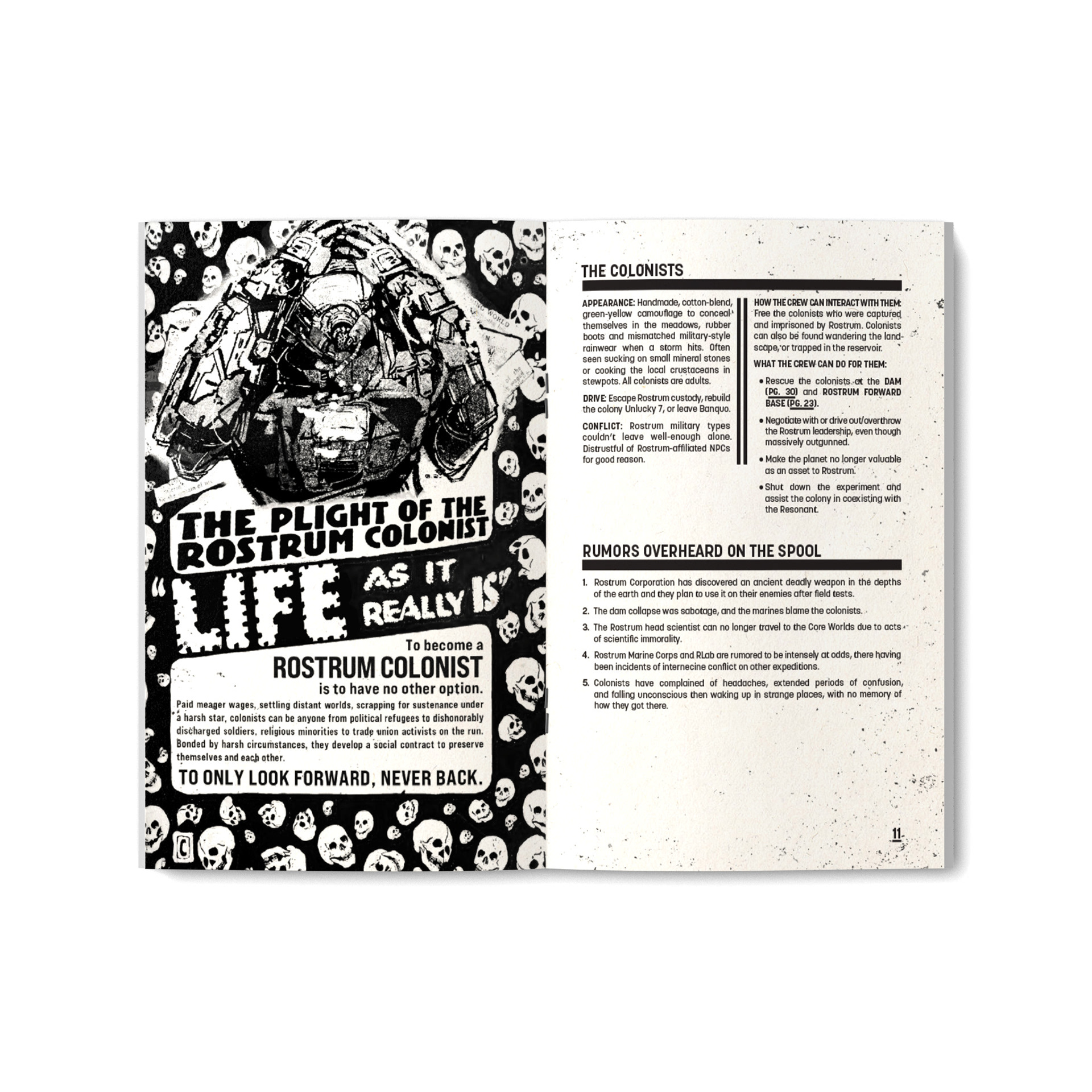
Fans of my work might see echoes of Libreté’s design here, the juxtaposition of a single sans-serif type with thick lines evoking columns and girders. The fact that both games take place in a mostly-abandoned world where innocent people are forced into increasingly small settlements and left to defend themselves against an overwhelming alien force is probably a coincidence.